Into the Blue
More than just a colour…Blue invites you to explore a world of mood, emotion and inspiration, where every shade has a story to tell…where will your imagination take you on this Blue adventure…
Blue is so much more than simply a colour - it can represent an object, an animal, elements in nature, or even a feeling waiting to be expressed. You might explore the countless shades of blue, create a blue still-life, or investigate how artists have used this versatile colour throughout history. The more you explore this theme, the more you'll discover just how many creative paths it can lead you down.
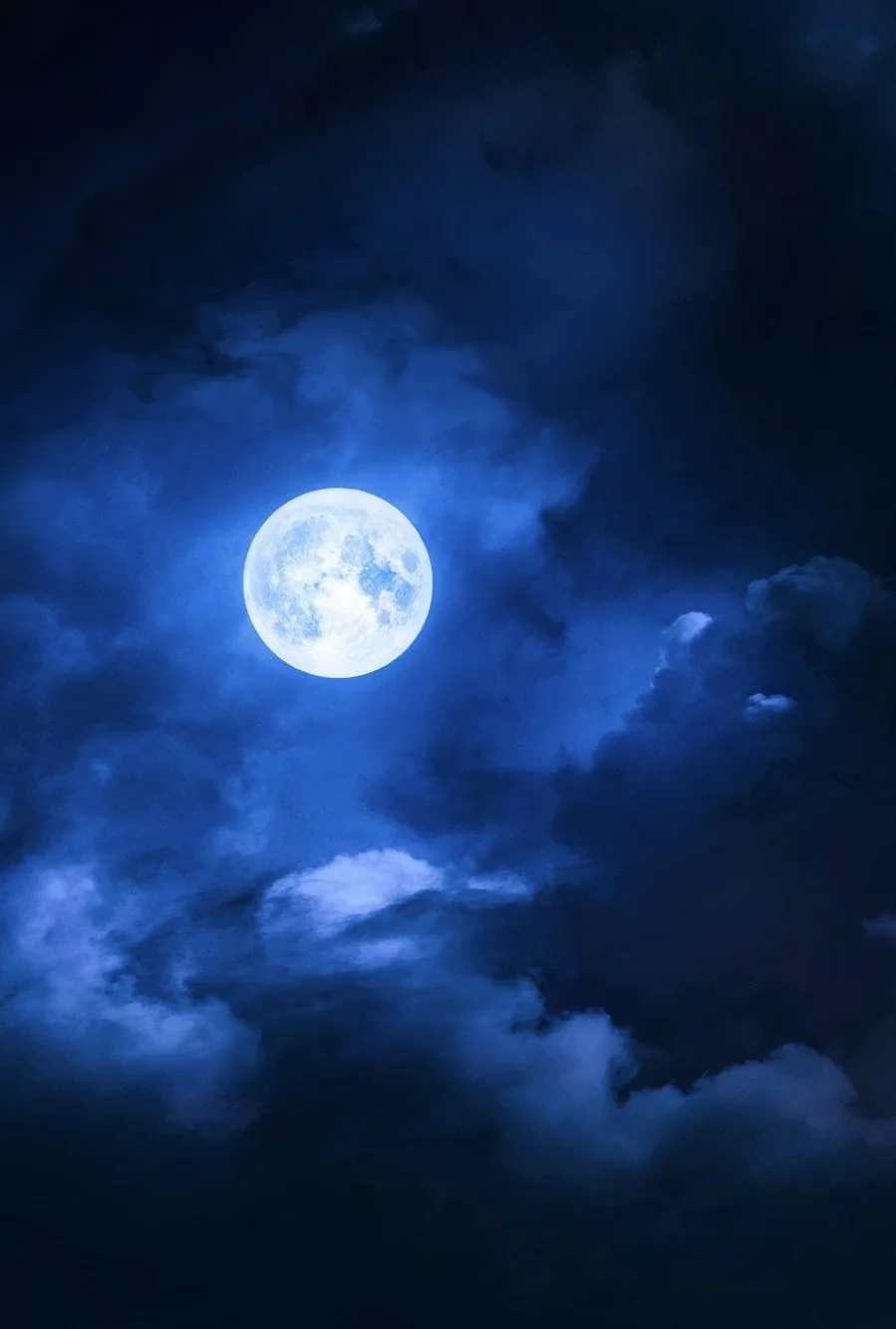

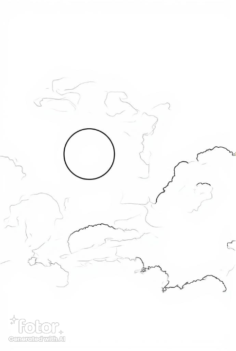
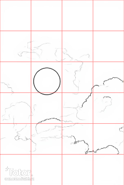
Look beyond the obvious and let words, music and everyday expressions spark your imagination. Phrases such as ‘once in a blue moon’…’blue horizon’…’out of the blue’…’the deep blue sea’ or ‘something old, something new, something borrowed, something blue’ …these could all be a starting point for your next painting - or even it's title.
Perhaps you're drawn to the emotion of ‘feeling blue’ - ask yourself what sadness, loneliness or quiet reflection might look like if they were translated into paint. How can colour, composition and imagery work together to tell an emotional story? Think about how the different shades of blue could help you, the direction of light you use, any surrounding objects, or even the position of a figure within the composition. Will the type of marks you make enhance the feeling?
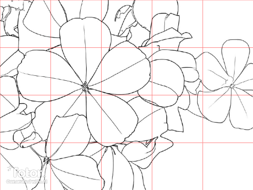
Blue is a fantastic colour for creating light, depth and atmosphere in a painting. Lighter blues can create the illusion that distant objects, such as hills or mountains are further away – a technique known as aerial perspective. While richer, darker blues can be used to strengthen shadows, adding depth and contrast to help your painting feel more three dimensional.
By experimenting with different shades, you'll discover just how much blue can influence the mood and depth of your work
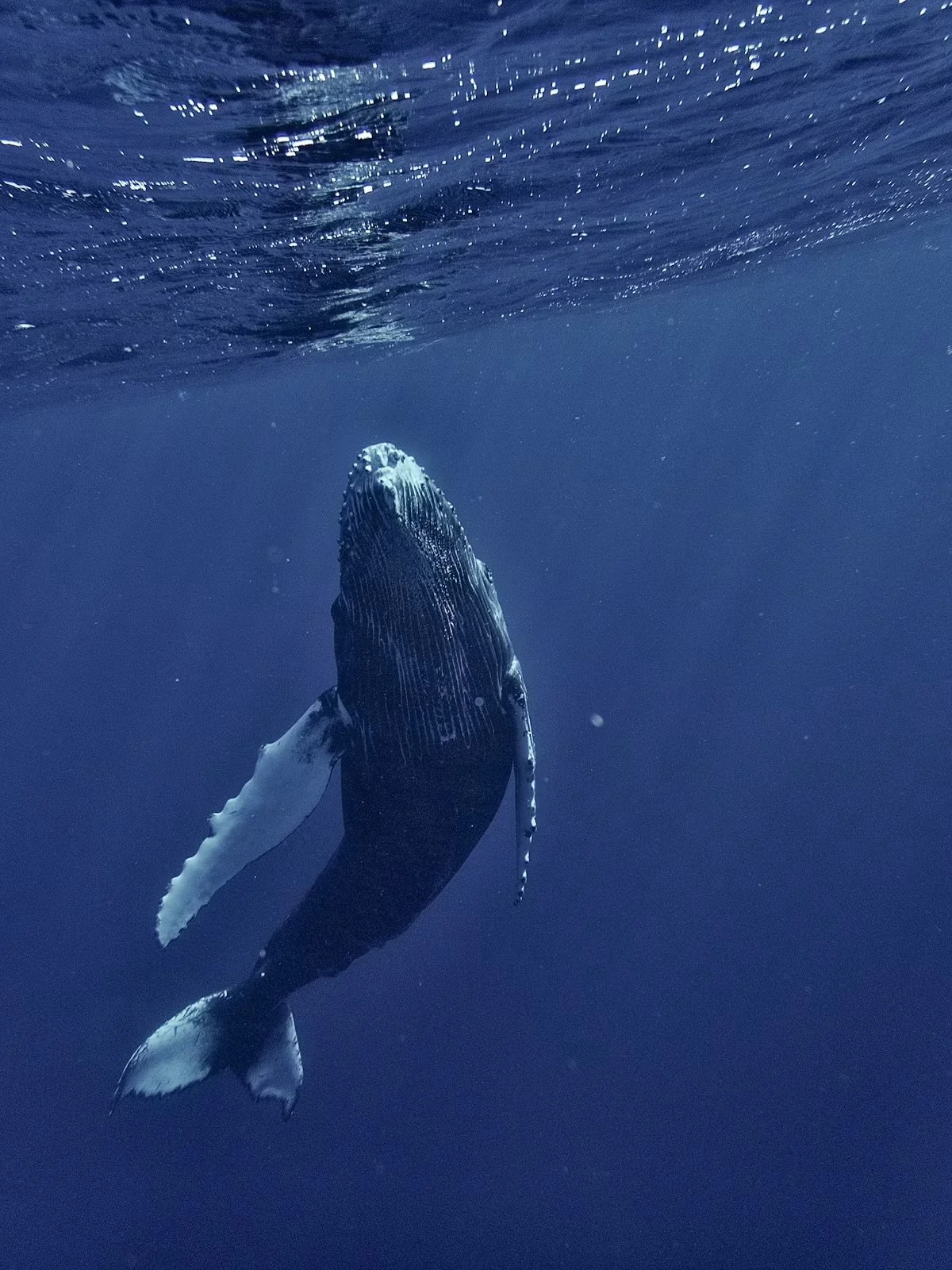
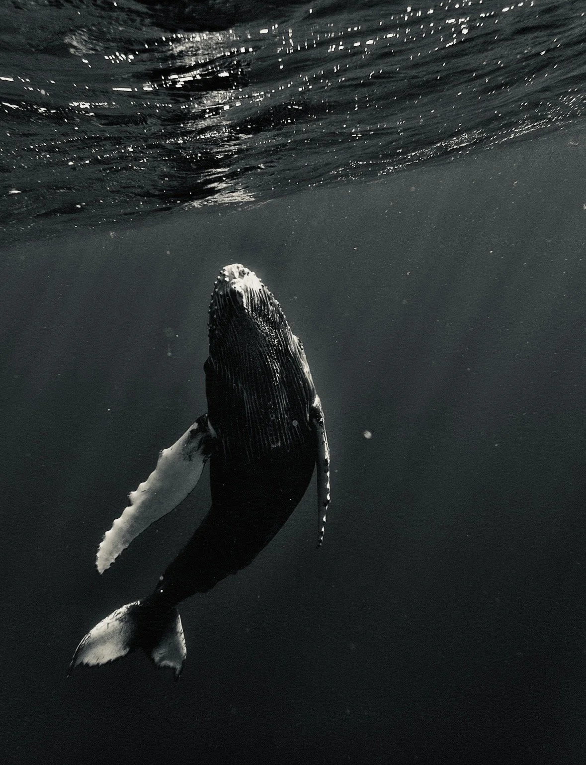
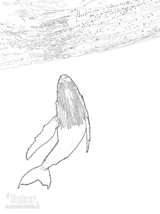
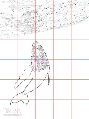
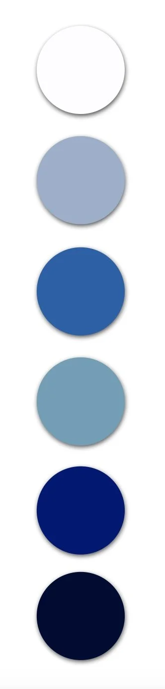
Things to consider - Creative Prompts & Ideas…
So what do you think of when you hear the words Into The Blue…
Is it the Natural World…
the deep blue sea, crashing waves or tranquil lakes
or is dramatic midnight skies, or soft summer clouds
distant mountains fading with pale blues
blue flowers, butterflies, dragonflies or birds
ice blues of snow and the cool colours of winter
Or Perhaps it's an Object…
blue and white Delph ceramics or delicate China
a row of glass bottles catching the light
old painted doors or shutters
boats on a beach, or an old favourite car
a blue hot air balloon in a blue sky
a selection of blue fabric, catching the light in its folds
Maybe it's a Feeling or Mood…
a sense of calm, peace, and stillness
solitude or quiet reflection
the melancholy of feeling blue
the magic of twilight or moonlight
Could Words, Phrases or Lyrics inspire you…
Once in a Blue Moon; Out of the Blue
Blue Skies; Blue Moon; Blue Horizon
Blue Suede Shoes, Rhapsody in Blue
Singing the Blues
Could one of these be the title of your next painting?
Explore the Colour itself…
soft sky blues; cornflower blue
midnight blue; prussian blue; indigo
ultramarine; cobalt; cerulean; phthalo blue
how many combinations and tones can you create
how might each colour change the mood of your work
Or, Perhaps Blue is Simply Light…
morning mist over distant hills on a cold winter morning
reflections on water in bright daylight, or moonlight
blue shadows in icicles and glaciers
artificial stage lighting in a blues bar
subtle blue light in raindrops on glass panes
What ideas are starting to emerge, and how can you capture them. How can the following help you achieve the effect you want…
the size and shape of your paper or canvas
which colours are you imagining
which materials will help - explore a few ideas
what techniques will you try - play and have fun
do you want it to be realistic; expressive or abstract
could this be a series of paintings or a sketchbook full of exploration and trying out new ideas
Whatever you decide, I hope this has given you the spark of an idea to follow - and if you'd like to share your finish pieces with me, then please do... I'd love to see them
Colour Palette Inspiration
Colours aren’t just paint on a palette...they often suggest moods, places, seasons or even a new painting waiting to be discovered. Think of them as a ‘cast of characters' for your painting. Each colour with its own personality - some bold commanding attention, others quiet and more muted, offering you a softer, more gentle feel. Some will allow smooth transitions between colours, others will give you light, and on the opposite side of things, give you shadows and contrast. Learning about colour will be one of the most important aspects of your art adventure.
3 Ways to Play: choose one or all to experiment with...
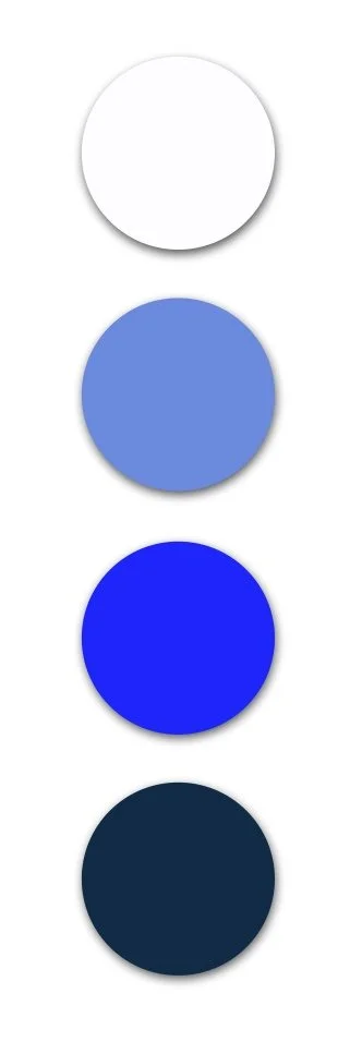
Colour Mixing • begin by simply trying to mix/match the colours you see on the samples shown. Make a note of the colour you start with and then which ones you add to change it. What combinations are you making...what will lighten or darken them, what will make them warmer or cooler…or more muted? This is such great practice, helping to improve your colour knowledge, and training your eyes to identify and mix colours successfully.
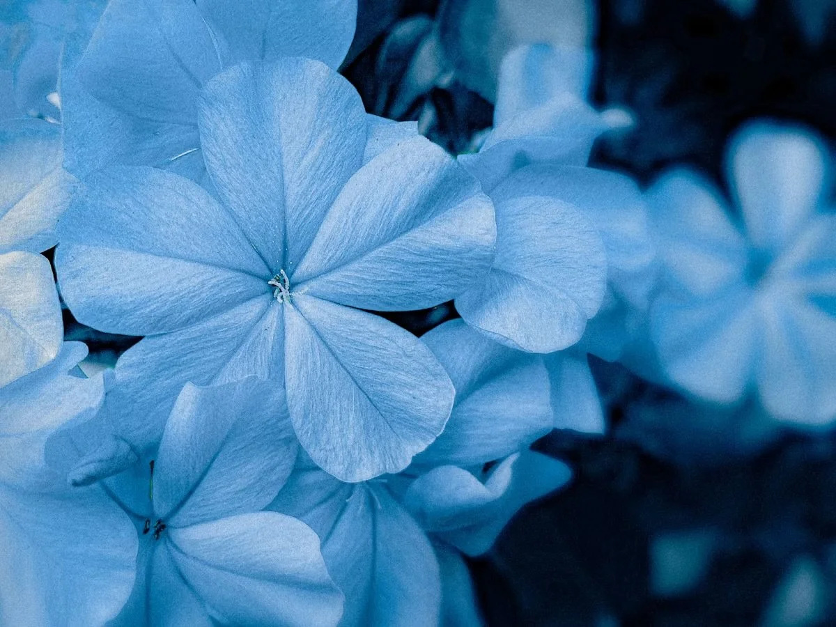
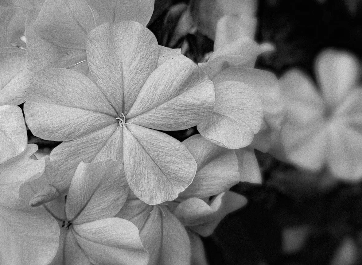
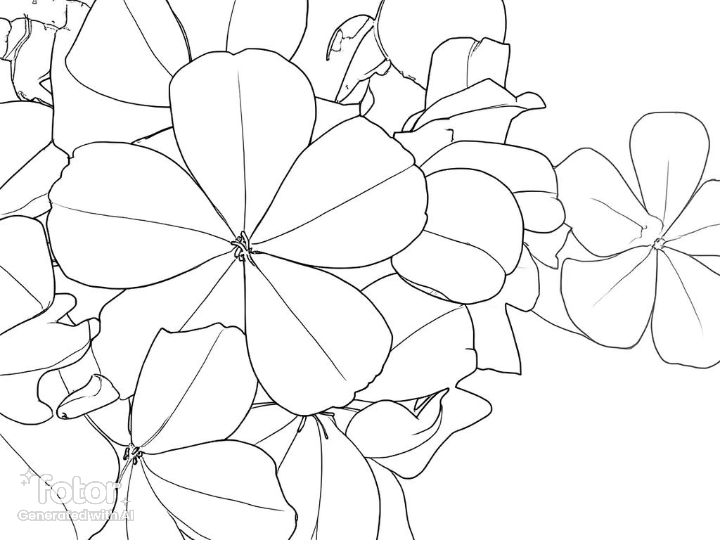
Use the Photo Reference • Use the colours and reference photo provided to paint your version of the scene in a medium you like - watercolour; acrylics or pastels...it doesn’t matter, just have fun.
Imaginative Play • Cover the reference photos so you’re not influenced by them. Now choose a colour palette and let that alone guide you. What do you feel when you look at the colours as a set, what do they suggest to you…a landscape or seascape; something floral perhaps, or a portrait? Do they give you a sense of warmth, cold, or something atmospheric; do you see a particular season; time of day or weather condition; do they make you feel happy or sad; do they have a sense or drama or tranquility…?
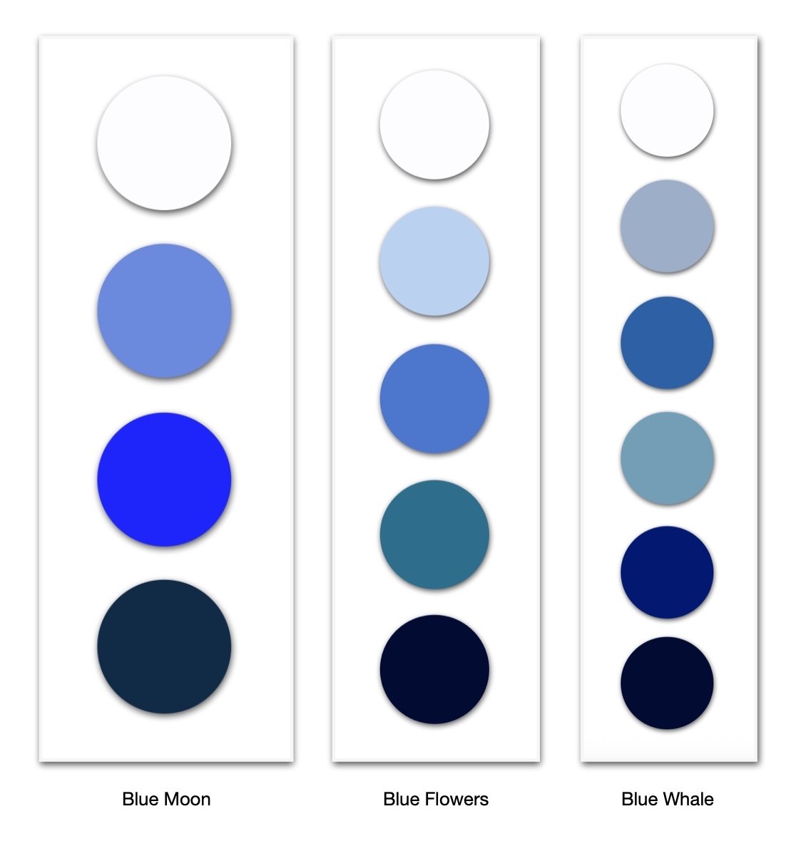
Explore what these colours mean to you, what they remind you of - then play. The important part is that your painting should belong to this colour family. Try to stay with them and see how they shape your colour mixing and ideas…feel free to add white/black to your palette if you need to lighten/darken tones.
A selection of other photographs from Unsplash for you to browse through…
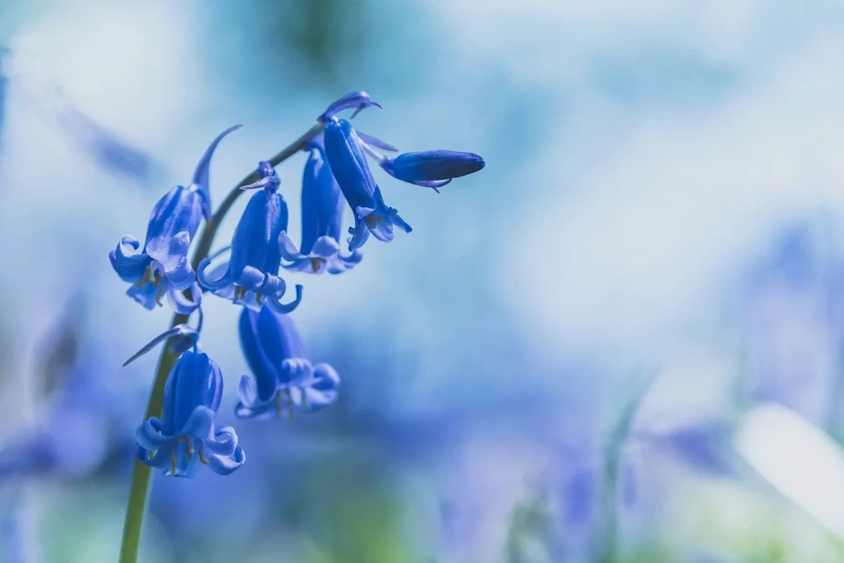
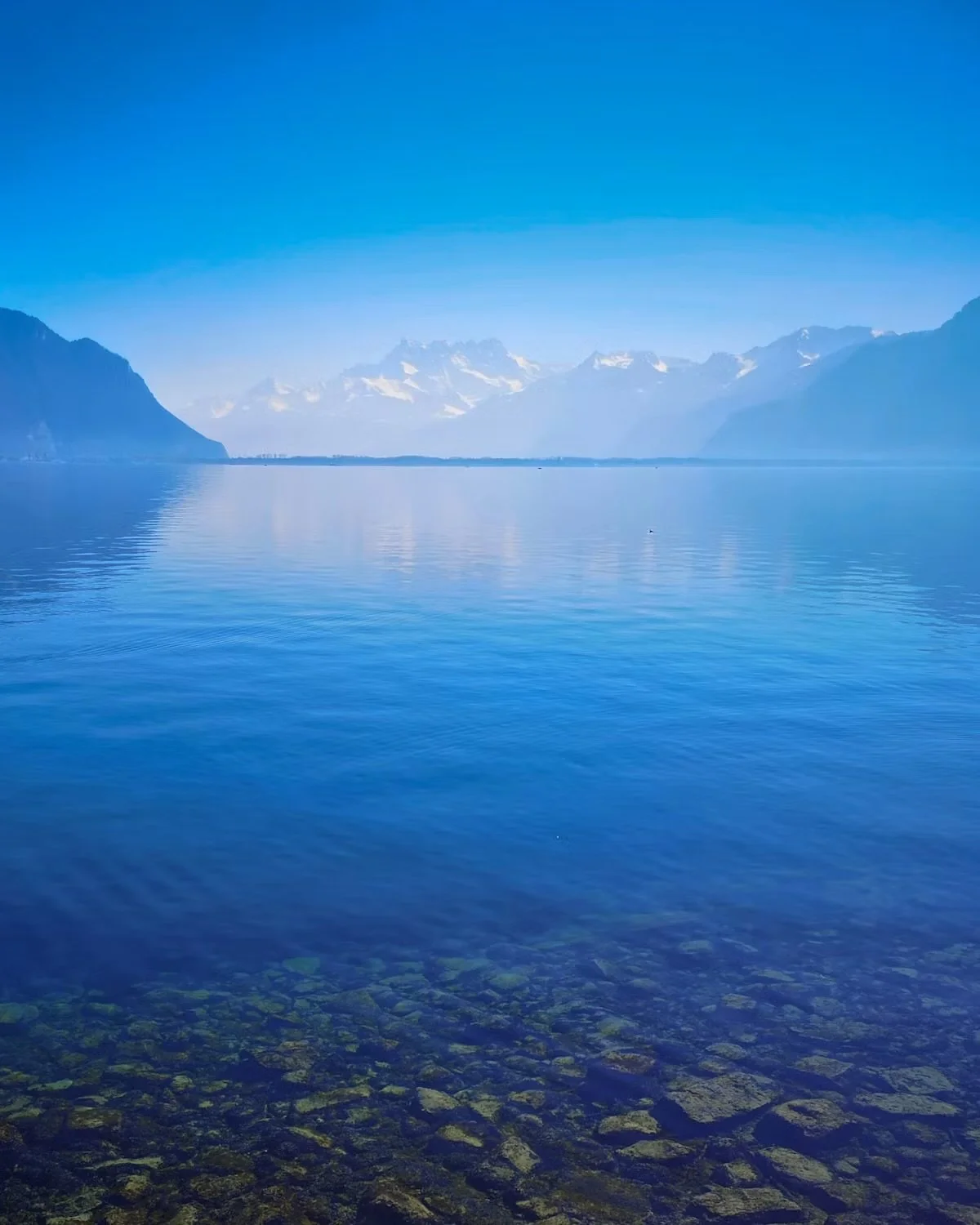
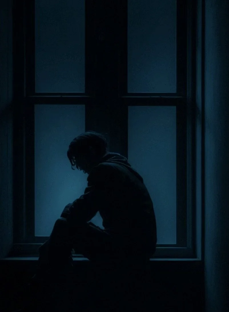
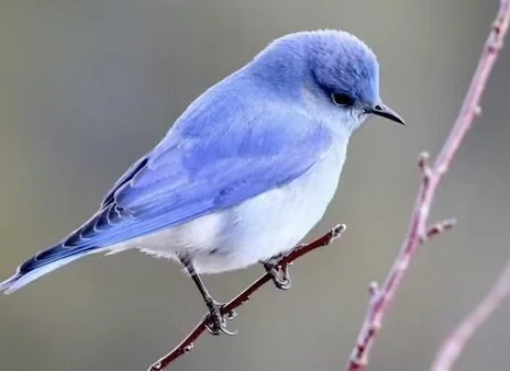
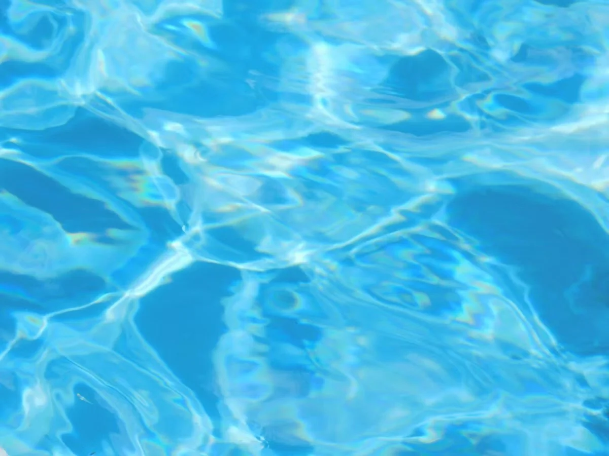
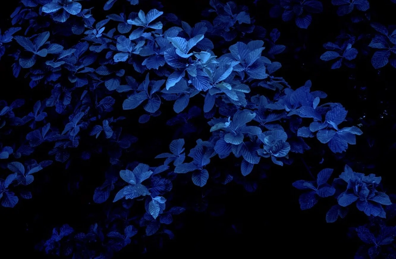
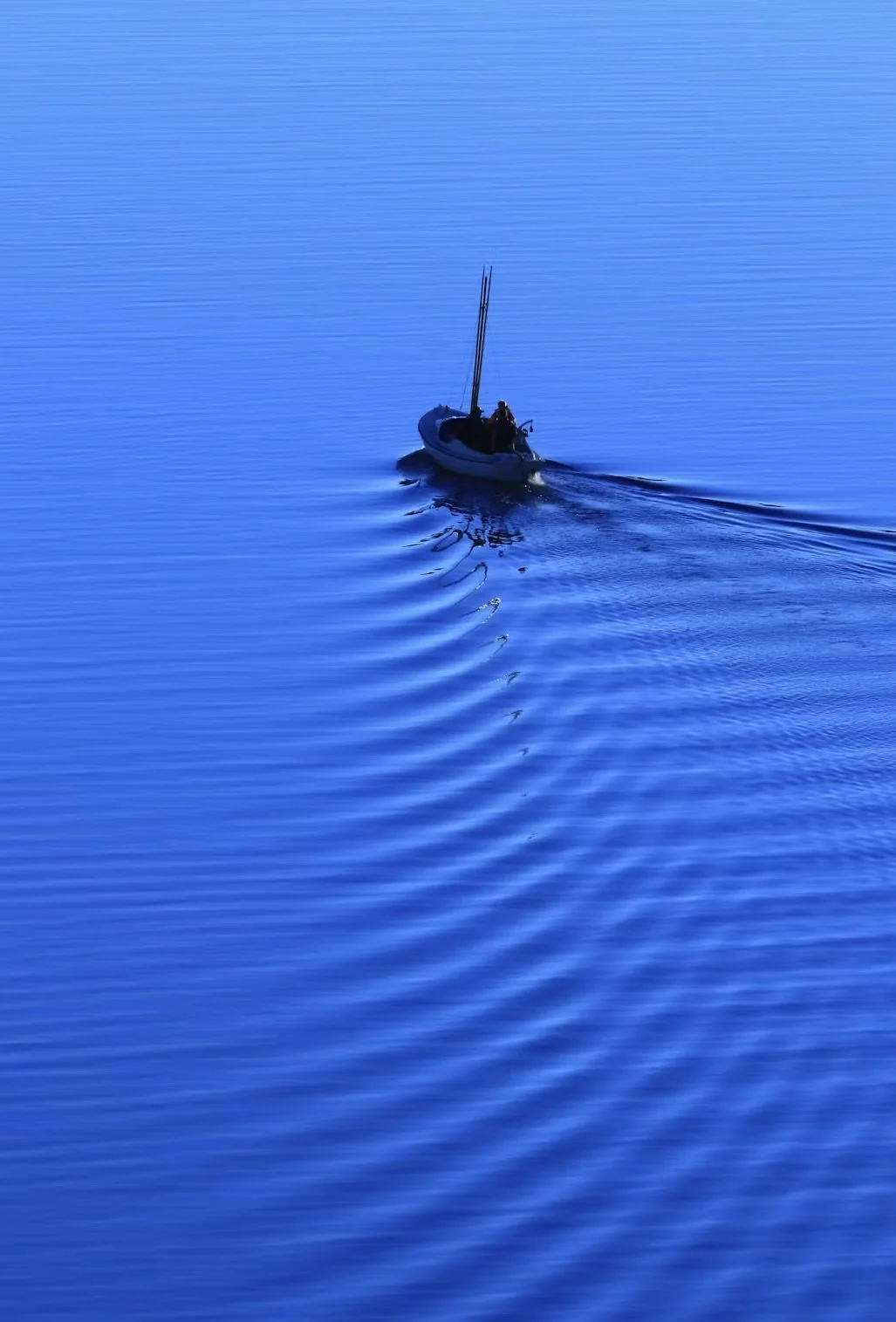
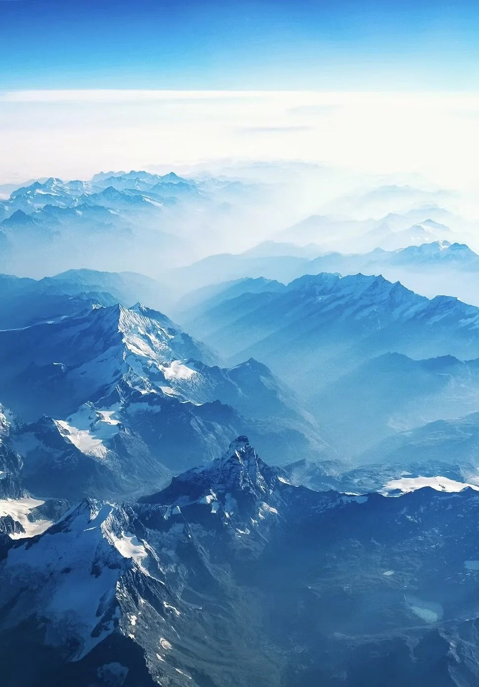
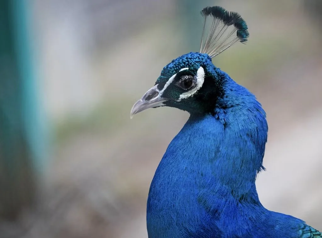
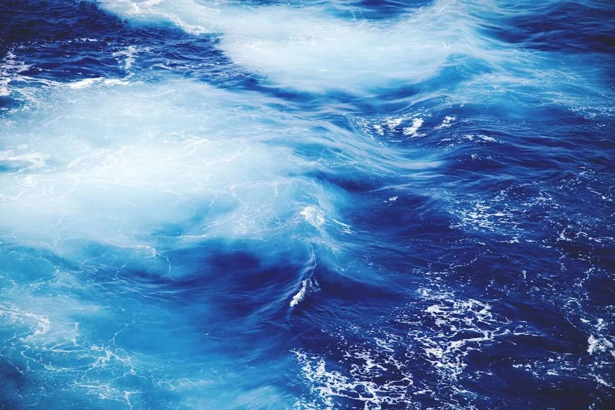
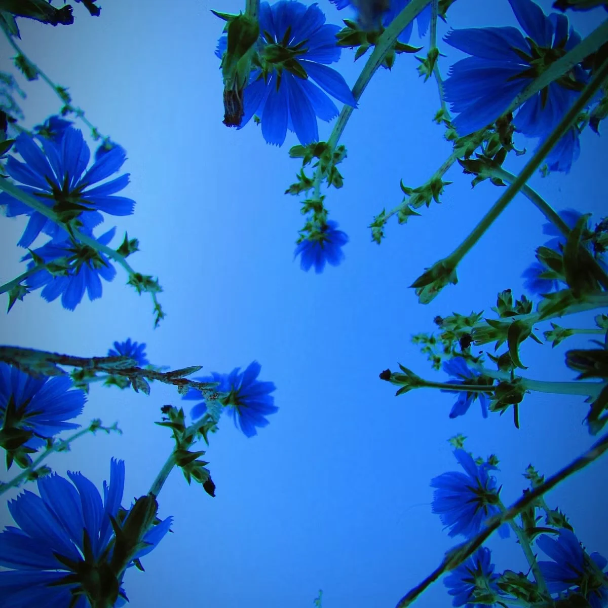
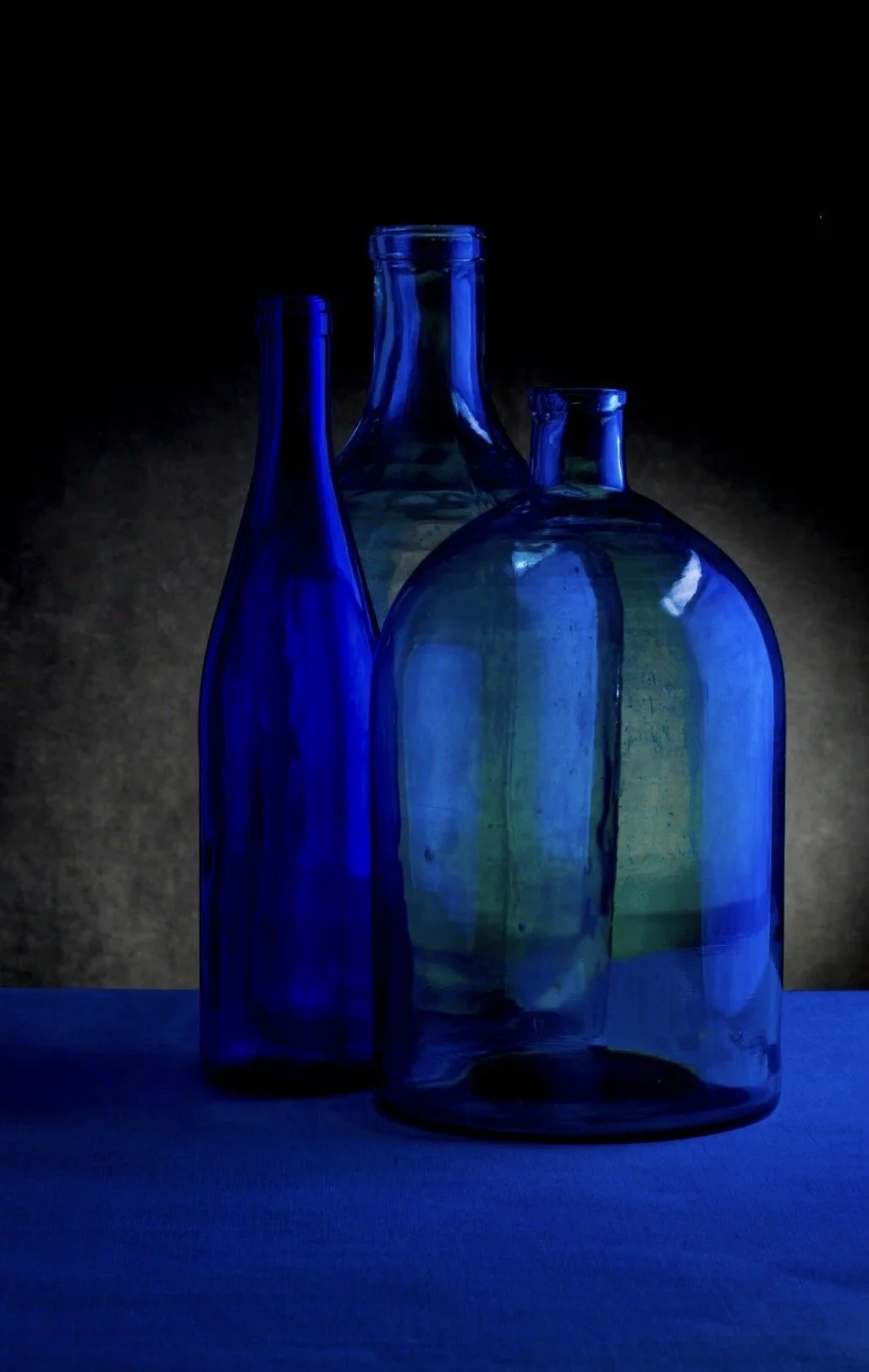
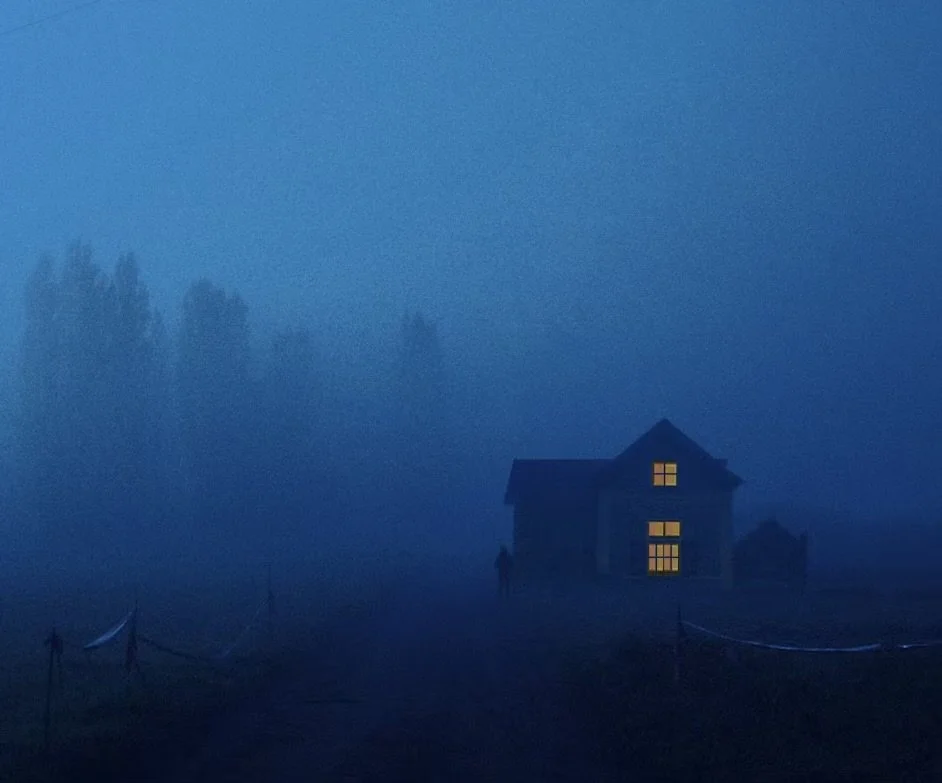
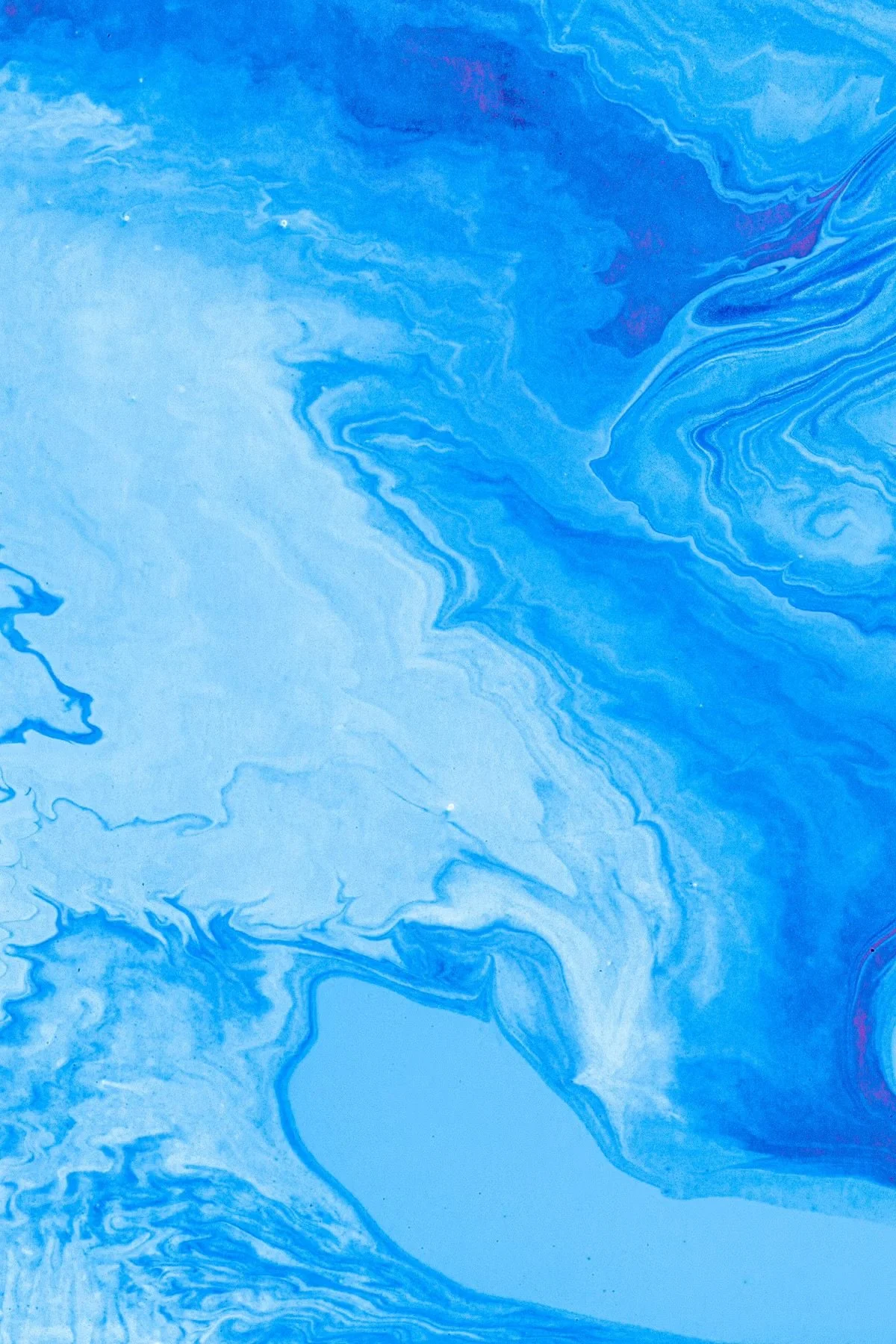
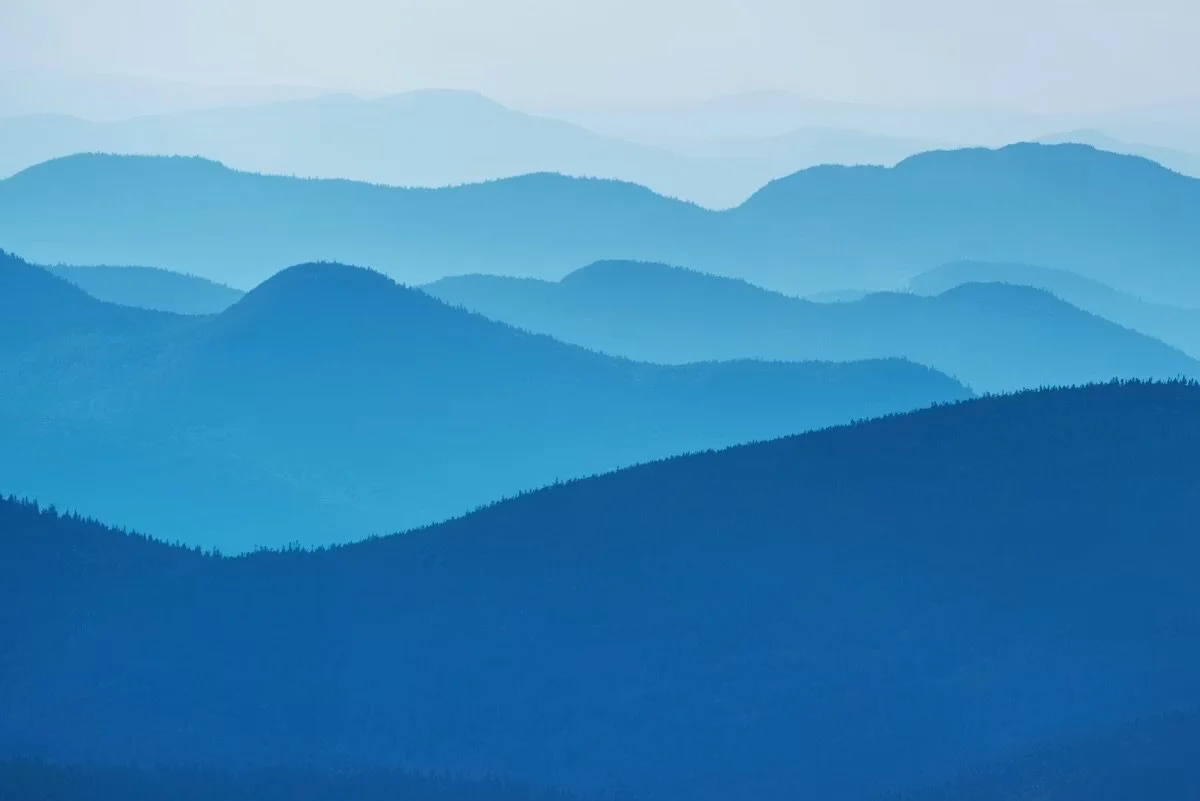
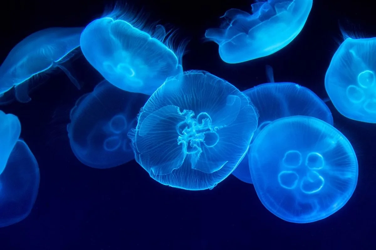
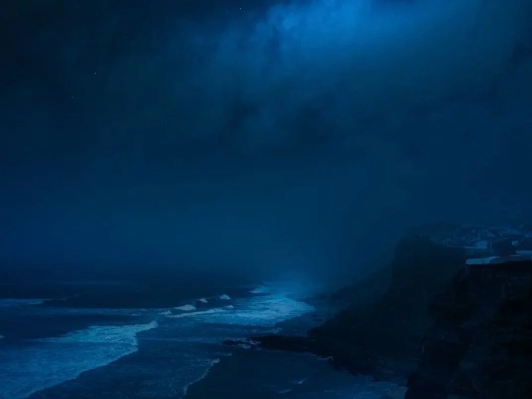
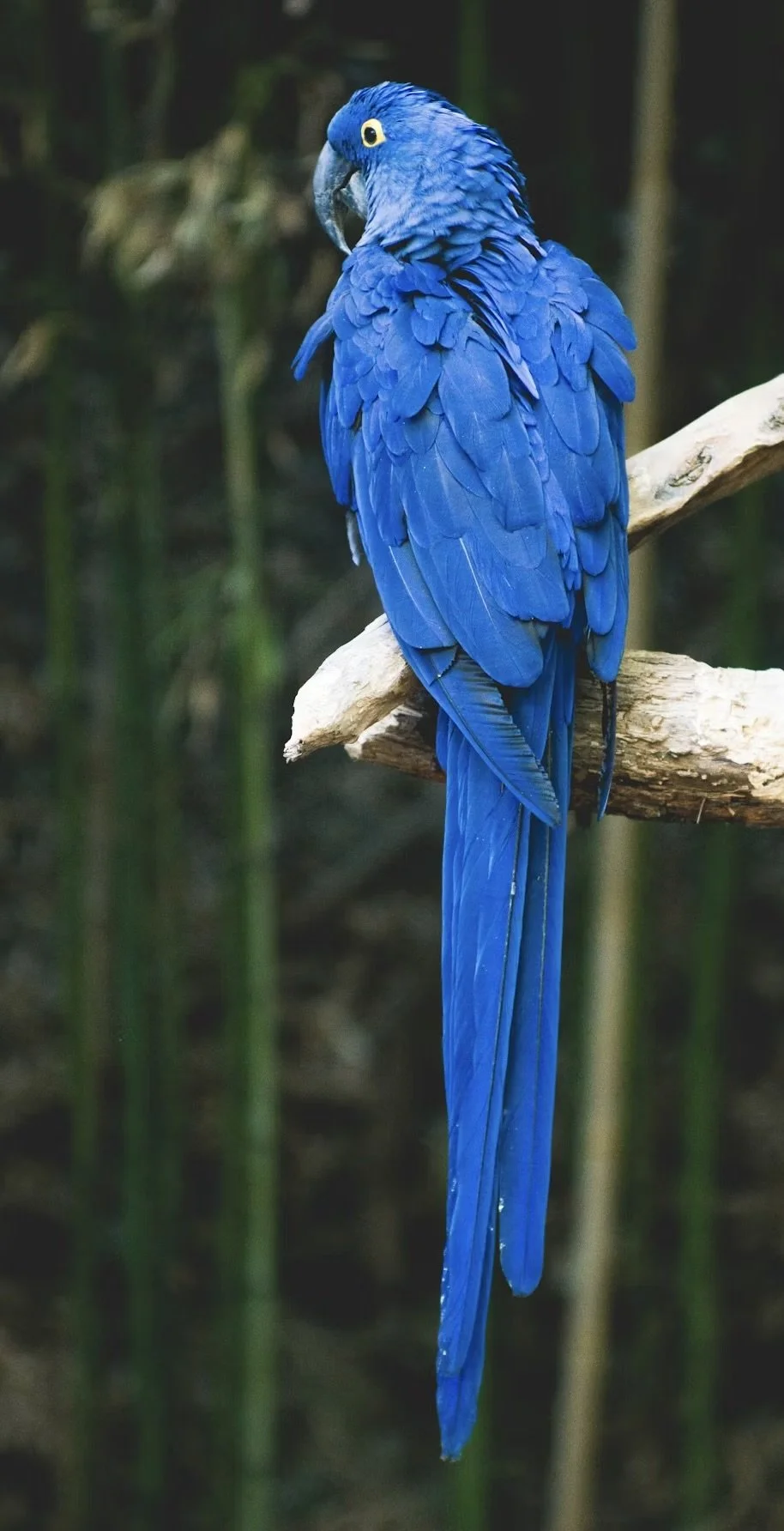
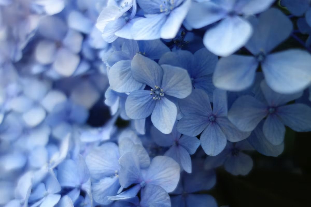
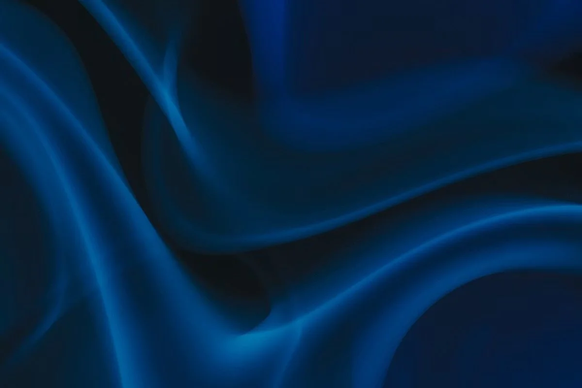
Please note: when using reference images, be mindful of copyright. Websites such as Pixabay and Unsplash offer royalty-free images that are safe to use. You might also discover that your own photos provide a more personal starting point.