Watercolour
…is one of the most beautiful and distinctive painting mediums, known for its luminosity, transparency, and the way colour and water interact on the paper.
Watercolour paints have been used by artists for centuries and remain one of the most expressive and elegant forms of paint. Made from finely ground pigments suspended in a water-soluble binder, watercolours are activated with water and applied in translucent washes that allow light to pass through the paint, giving a luminous, delicate quality to the finished work.
One of their greatest strengths is their transparency and fluidity. They can be used with a very light touch to build soft, atmospheric layers, or layered gradually to develop richer tones and greater depth. Because the paint moves so freely with water, it encourages a more spontaneous and responsive way of working, where timing, control, and intuition all play an important role.
Watercolour Paints…an Introduction
For those just learning to paint, watercolours offer an easy introduction, with just a few simple materials you can soon get started - a small set of paints, a few brushes, and some good quality watercolour paper are enough to begin exploring this beautiful medium. From the very first brushstroke, you’ll soon see how the paint flows, blends, and settles into the paper, encouraging a fluid and more instinctive way of working.
Rather than focusing too intently on trying to control it, watercolour invites you to observe and respond as the paint moves. It’s a medium that rewards curiosity and gentle experimentation, where each wash and mark you make can lead to wonderful unexpected results. There’s real enjoyment in watching transparent layers build and colours interact, creating soft, luminous effects that are unique to watercolour painting.
Some of the Benefits
a beautiful range of colours with naturally luminous qualities
watercolours dry relatively quickly, making it easier to build gentle layers and develop depth
brushes and tools are easily cleaned with water
no solvents required, keeping the process low odour, and easy to work with in any space
ideal for creating soft washes, subtle transitions, and fine detail
encourages a more fluid, expressive approach, where colour can move and blend in unique and often unexpected ways
lightweight and portable, perfect for taking on location
The main challenge with watercolour is its unpredictability, and the tendency to over-work brush marks creating muddy areas of colour. But, with patience and practice, a lightness of touch can be developed and the unpredictability of it becomes part of its charm, helping you become a more confident and responsive artist.
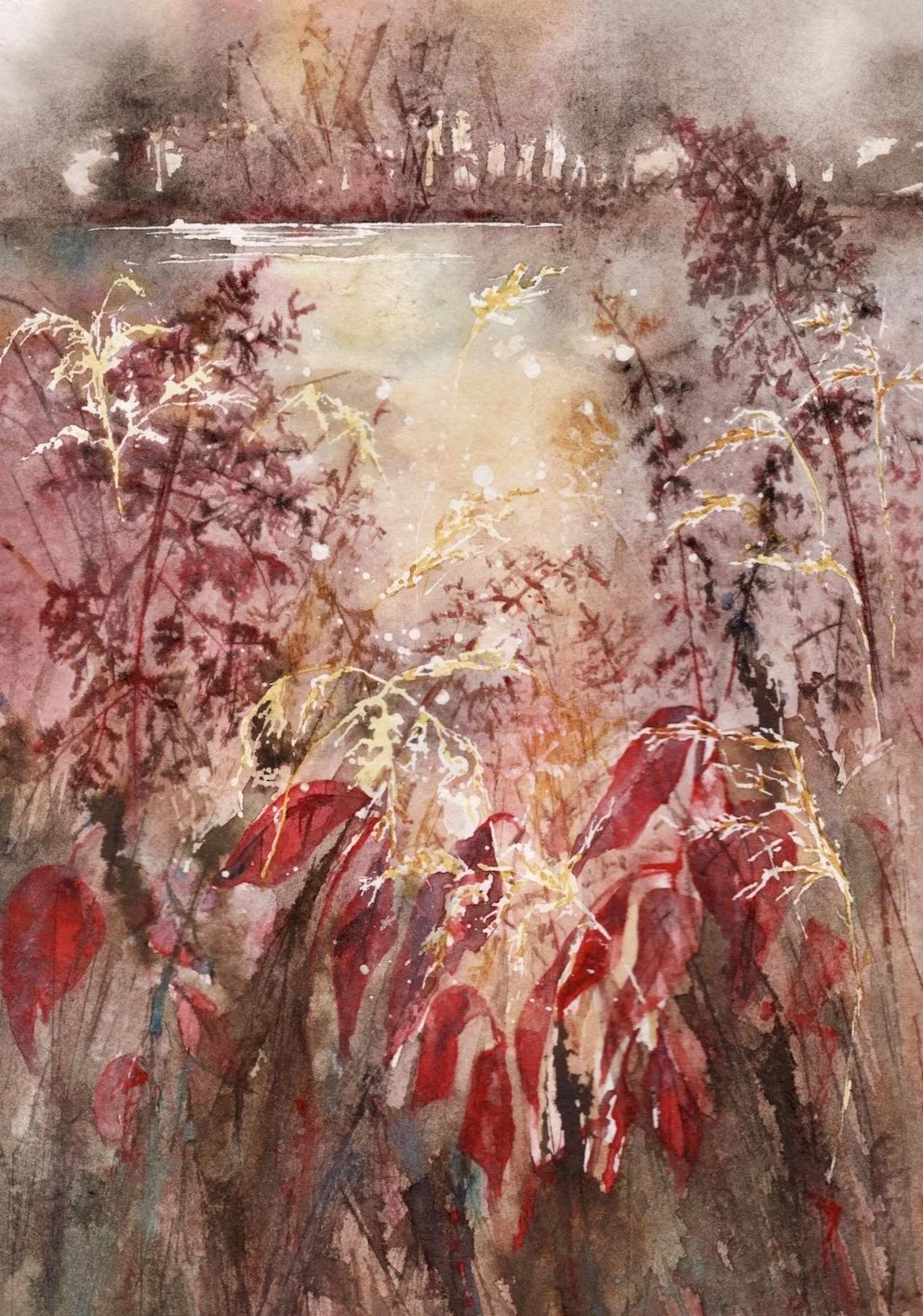
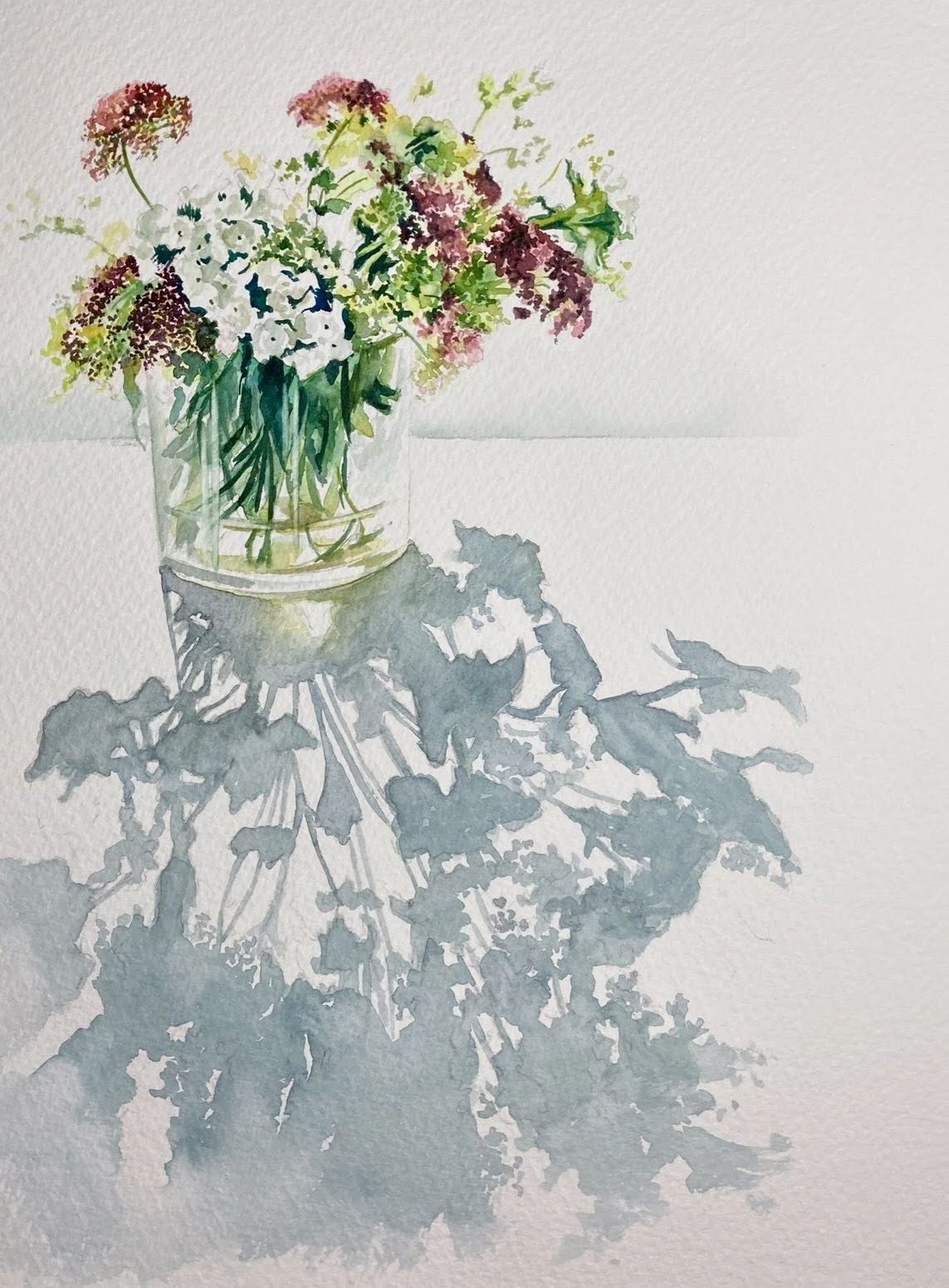
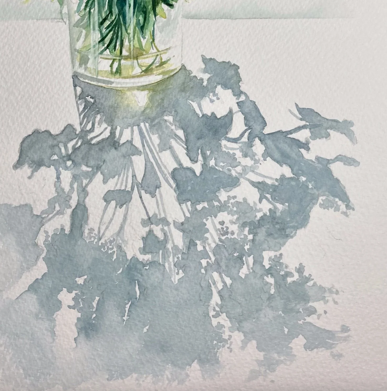
Image kindly supplied by student Caroline Baggaley
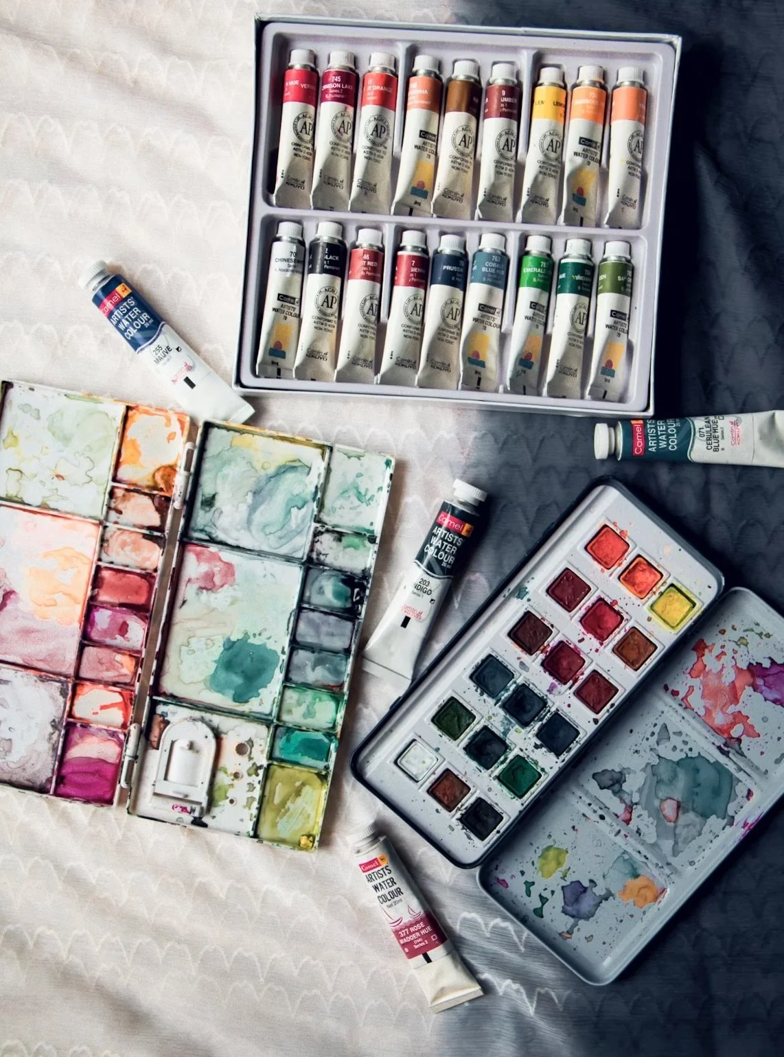
Which colours to start with?…
A good watercolour palette doesn’t need to be huge to get started, in fact, just a few, well-chosen colours will teach you far more about colour mixing, than a huge selection will - too many colours can often feel overwhelming.
Many beginner sets are designed around this idea, including a balanced selection of primary and secondary colours to give you plenty of flexibility, and opportunities to learn about colour.
Colours can often vary depending on the brand you buy, but as long as you have something similar to those suggested here, there’s no need to worry. We'll delve more into brands and their differences later.
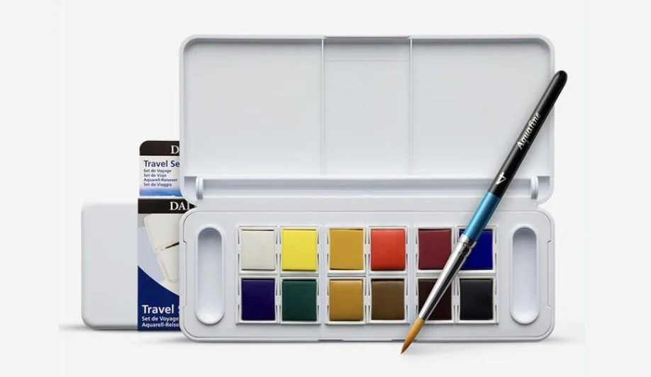
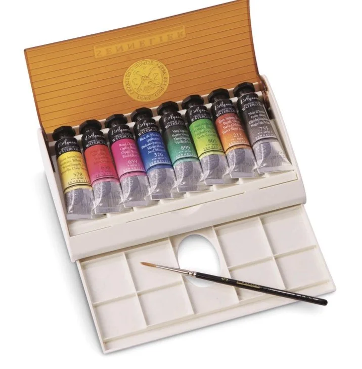
Buying a pre-selected box of paints is usually a good, cost effective way of starting, and most include these colours.
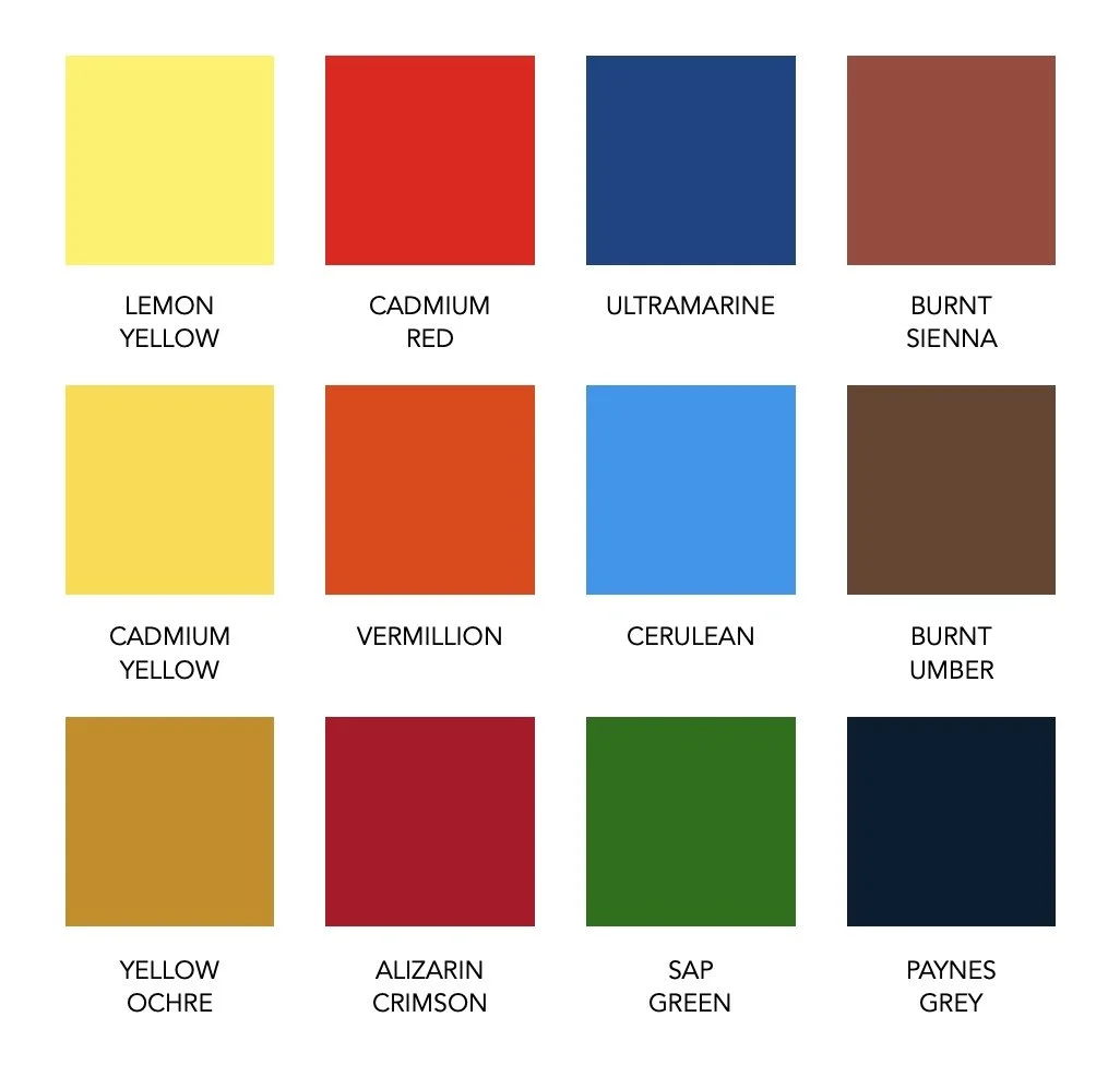
Basic set of colours
Watercolour paints are available in both pans and tubes, and while they contain the same ingredients, they offer slightly different ways of working…
Pans are solid, dried cakes of paint that are activated with water, making them convenient, portable, and ideal for controlled, lighter applications.
Tubes, on the other hand, contain soft, moist paint that can be used straight away, allowing for richer colour, larger washes, and easier mixing in greater quantities.
Many artists use a combination of both, choosing pans for ease and portability, and tubes when they want more intensity and to cover a larger area in their work.
Why this works
This basic set of colours gives you a good balance of warm and cool primaries, along with a few natural earth colours, allowing you to mix a wide variety of tones without needing dozens of paints.
Note: with watercolour, it’s useful to remember that water is your white…this will lighten colours and keep their luminosity.
Often by adding white as an actual paint, you’ll make the colour you’re mixing it with more opaque.
Which brand to choose…and what’s the difference?
As well as choosing which colours we’d like to work with, we’re also faced with a wide range of watercolour brands, and options - and the inevitable question…which should I buy?
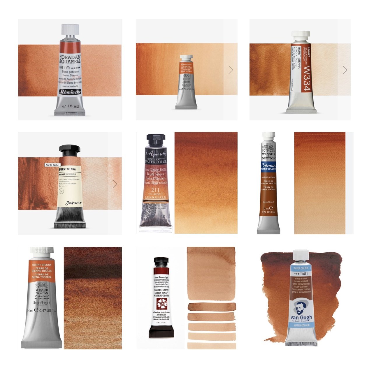
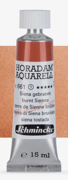
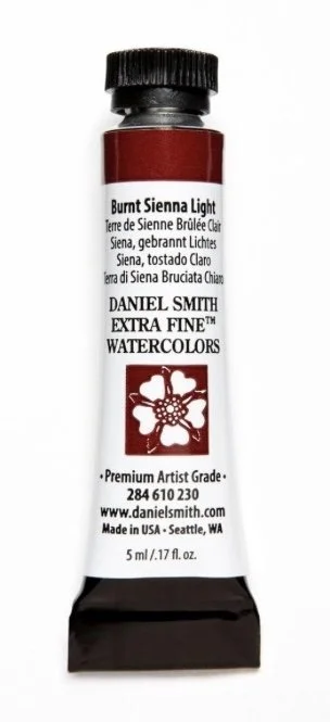
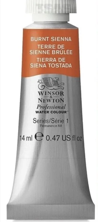
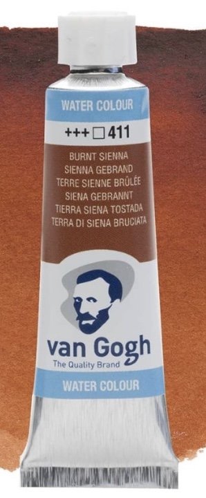
Even a quick search for something like Burnt Sienna will reveal just how many variations are available - see how many subtle differences there are here with the same colour. It’s easy to see why it can feel a little overwhelming when you’re starting out.
My aim with this section is to try and simplify some of those decisions for you, so when you next come to buy paints, you can do so with a little more clarity and confidence.
To keep things simple, it helps to think of watercolour paints in two main categories: student quality and artist quality.
One of the first differences you’ll notice is the price…
student-grade paints are more affordable because they usually contain less pigment and often include additional fillers to increase volume, this can make colours appear slightly weaker or less vibrant when diluted with water.
artist-quality paints typically contain a higher concentration of finely ground pigment, giving richer, more vibrant colour, better transparency, and greater consistency when layering washes.
These differences may seem subtle at first, but they can have a real impact on both the painting experience and the final result - which is why many artists gradually explore different brands and ranges to find what best suits their way of working.
Student vs Artist Quality
Are all watercolour brands the same?…not quite
Understanding this can really help when you’re starting out, as it influences not just the strength of colour, but also how the paint flows, layers, and responds on the paper.
There can be noticeable differences in…
pigment strength and lightfastness
transparency
how easily the paint moves
how well it lifts or builds in layers
the overall colour range…and of course, price.
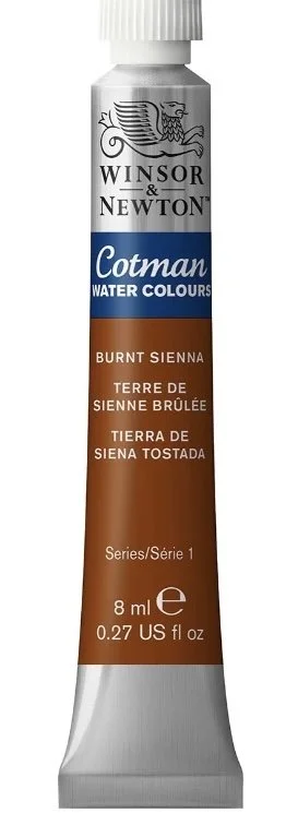
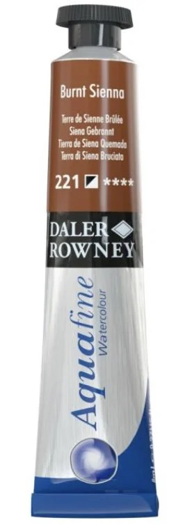
Student-Grade Watercolour
Student-grade paints are generally designed to be more affordable and accessible, making them a practical choice for learning, experimentation, and regular practice. Good for beginners, but quality can vary…tube sizes tend to be larger, so better value
Examples include:
Winsor & Newton Cotman
Van Gogh (Royal Talens)
Daler Rowney Aquafine
Pros of Student-Grade Watercolours
more affordable – practical, low-cost way to begin
great for learning – practice pieces, colour mixing exercises, and getting to know how watercolour behaves
less intimidating – encourages experimentation and a relaxed approach, without worrying about wasting paint
widely available – easy to find in most art shops and online, often in ready-made beginner sets
develops confidence - good for early exploration, useful for sketches, practicing washes, blends, and brush control
Cons of Student-Grade Watercolours
lower pigment strength – colours can appear weaker or less vibrant, especially when heavily diluted
less transparency and clarity – washes may not have the same luminous quality as higher-grade paints
more filler content – can affect how smoothly the paint flows
less lightfast – some colours may fade more quickly over time
less predictable mixing – colours may not always behave consistently when blended, making learning colour mixing slightly less precise
Artist-Grade Watercolour
Artist-grade (or professional-grade) watercolour paints are made with higher concentrations of finely ground pigments, offering richer colour, greater transparency, smoother flow, and improved lightfastness - resulting in a more consistent finish.
Examples include:
Horadam Aquarell by Schmincke
Daniel Smith
Winsor & Newton Professional
Holbein
Sennelier
Tip: Artist-grade watercolours are often in small tubes with tiny writing that’s difficult to read, so take a photo of it and then zoom in on your phone to see the details
Pros of Artist-Grade Watercolours
higher pigment strength – produces richer, more vibrant colour even when heavily diluted
excellent transparency – allows for luminous, glowing washes and beautiful layering effects
smoother handling – flows more evenly on paper and mixes more predictably
better lightfastness – colours are more resistant to fading over time, improving longevity of work
greater consistency – reliable performance across brands and colours - important for professional work
Cons of Artist-Grade Watercolours
higher cost - higher-quality pigments and production make them a bigger investment
less forgiving for beginners – strong colour intensity can take a little getting used to when learning control and dilution
easier to overuse – because the paint is so strong, it’s easy to use more than you actually need, causing expensive wastage
wider range can feel overwhelming – large colour selections and subtle variations between pigments can be confusing at first
What to Look For When Buying Acrylics
pigment quality – higher pigment generally means stronger, cleaner colour and better results when diluted
transparency – important for achieving those luminous washes and layered effects watercolour is known for
lightfastness – look for paints rated as good or excellent to ensure your work won’t fade over time
format – decide whether pans, tubes, or a combination best suits how you like to work
colour selection – start with a balanced range rather than too many colours, avoid over complicating choices
brand consistency – established brands tend to offer more reliable performance across their ranges
budget vs intention – choose materials that suit your current stage, whether that’s learning and experimenting or creating finished, long-lasting work
Watercolour Can Feel Both Magical and Unpredictable.
Water moves, pigment blooms, edges soften, and colours gently merge into one another. Learning to work with these qualities, rather than trying to control them too tightly, is a big part of the watercolour experience. As you begin to understand how the paint responds, there’s something incredibly rewarding in allowing it to flow and settle in its own way, often creating soft, unexpected effects that bring a natural sense of lightness and life to your work.
Opaque and Transparent Colours
In watercolour painting, understanding which colours are transparent and which are opaque can make a real difference to the way your paintings look and feel.
Because watercolour relies heavily on light passing through transparent layers from the. paper, transparent pigments allow you to create fresher, cleaner mixes and more luminous washes, letting colours glow through one another.
More opaque colours behave differently. They can look more solid or chalkier when applied, and may dull mixtures slightly if overused - but they do have their place, and can be useful when you need more coverage, softness, or control in certain areas.
As you use different colours you’ll begin to notice how each one responds on the paper. Developing awareness of transparency and opacity not only helps with colour mixing, but also gives you greater control over depth, layering, and the overall mood of your work.
Sample done for a Watercolour Workshop
Opaque & Semi-Opaque Colours
…these allow less light to pass through, giving a softer, more covered effect
useful when you need a little more solidity in a painting
can help deepen areas of colour
helpful for subtle highlights and layering darker tones over lighter areas
can create more muted, chalky or earthy colour mixtures
Examples often include:
yellow ochre
cerulean blue
cadmium red; cadmium yellow
naples yellow
To identify if a colour is opaque or semi-opaque most tubes indicate a transparency rating on the label. For opaque colours there will be a solid black square, and for semi-opaque there will be a half-filled square
Also if the name of the colour includes a metal in it - ie: cadmium; cobalt; zinc or titanium then it’s more than likely opaque…having heavier pigments.

Visual Clues for Opaque Colours:
Cloudy Water - if you rinse your brush and the water instantly turns ‘milky’ or cloudy, it’s a sign of an opaque pigment
Chalky Dried Finish - opaque colours often dry matt, flat, or chalky, whereas transparent colours appear to ‘glow’
Lying on Top - when wet, if the paint seems to stay purely on top of the paper rather than sinking in, it’s likely to be opaque.
Transparent Colours
…these allow light to pass through, letting the whiteness of the paper and any previous washes show beneath.
ideal for glazing and building delicate layers of colour
create a luminous, glowing quality that watercolour is so well known for
excellent for mixing fresh, clean colours without them becoming heavy or dull
useful for creating loose washes, where the pigments flow and spread easily
particularly effective for subtle transitions of colour and creating shadows
Examples often include:
phthalo blue; phthalo green
quinacridone rose; quinacridone gold
permanent alizarin crimson
hansa yellow; indian yellow
transparent pyrrol orange
To identify if a colour is transparent or semi-transparent the transparency rating on the label will show a open / white square, and for semi-transparent there will be a square with diagonal line
Often if the name of the colour is long, complicated, or has the word ‘permanent’ in it - it’s also likely to be transparent - strange but true.
Visual Clues for Transparent Colours:
Clear Water - if you rinse your brush, and can still see through the water, the colour is probably transparent
Palette Test - if the colour looks clean, thin, and allows the white of the palette to show through while mixing, it’s transparent
The Black Line Test
Draw a thick black line on a piece of watercolour paper using a permanent waterproof marker (like a Sharpie).
Paint a stroke of your watercolour paint across the line.
Let it dry completely, then
Transparent - the black line remains visible through paint.
Opaque - the paint covers the line, sitting on top of surface
Semi-Opaque - the line is visible but muted.
Fun Watercolour Effects to Explore
One of the real joys of watercolour is how playful and experimental it can be. Because the paint responds so naturally to water and movement, even simple techniques can create beautiful and unexpected effects.
Exploring these little experiments is a great way to become more confident with the medium while also keeping the process enjoyable and relaxed.
Example of salt in student work
Salt
sprinkling salt into wet watercolour absorbs some of the colour, leaving behind delicate starburst or crystalline textures when dry.
different salts create different effects, from subtle speckling (table salt) to dramatic pattern (rock salt - takes longer to dry).
it’s important not to add salt if the area is too wet, as this will overload the salt crystals and the effect won’t be achieved. Also make sure it’s just a ‘sprinkling’ of salt - don’t add too much.
let the area dry completely, before dusting off the remainder of the salt.
Clingfilm / Plastic Wrap
placing a loose layer of clingfilm or plastic wrap onto wet washes of colour creates wonderfully organic textures as the paint dries around the folds.
Be aware though, if the clingfilm is placed down too flat you won’t achieve any affects - also if its too ‘scrunched’ up - aim for a loose ‘baggy’ feel to it when you lay it down.
You’ll still have time once the clingfilm is down to manipulate it a little, so don’t panic, just use your nails to gently pull up sections of it to create more interesting marks, if it needs it
Pulled taught will create lines in the clingfilm / plastic wrap - ideal to suggest waves, or ripples on the waters surface, especially when combined with blues and greens.
It’s especially effective for suggesting rocks, foliage, or abstract backgrounds - but must be left to dry completely before being removed. Patience here is key for a great effect.
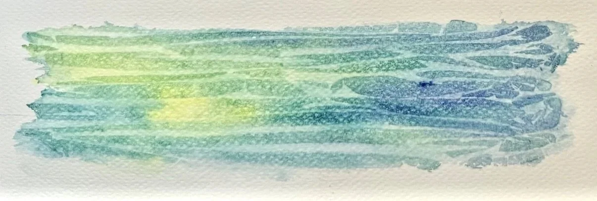
Image kindly supplied by student, Lesley Rollason
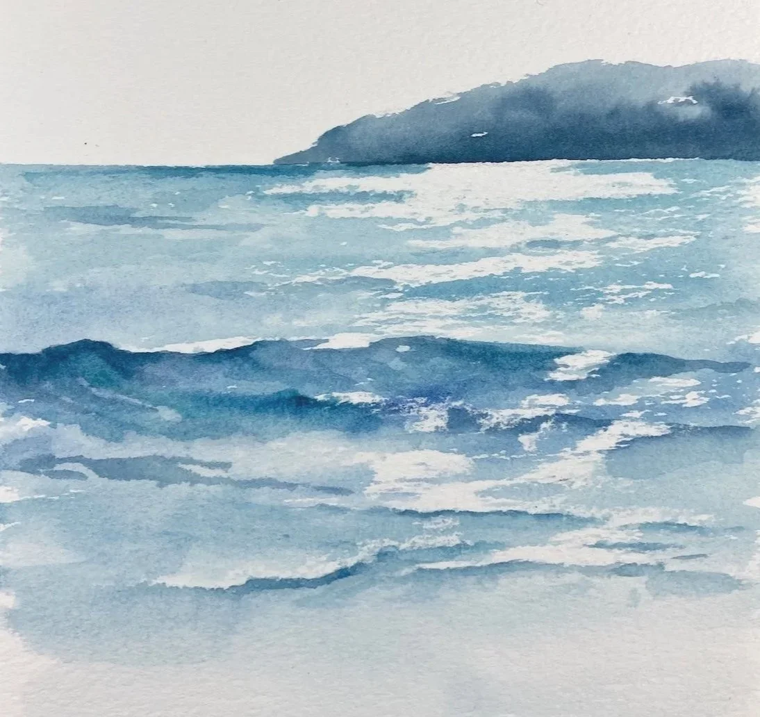
Sample done for Seascapes Workshop
Playing and exploring with materials…
…will teach you so much about not only the materials you’re using, but also about your personal preferences - things you like and things you don’t - it’s never a waste of time
Wax Resist
using candle wax, or a white wax crayon on areas of a painting will resist the watercolour when applied over the top. This allows you to preserve highlights or create interesting patterns and textures - ideal for creating the glisten of the sun on water.
paper surface plays a part with this, smoother paper will give a more solid line, whereas rough paper gives a more textured mark.
be cautious when applying, safe in the knowledge that you can always add more if needed - but that it’s difficult to remove if you add too much.
downside - because of it being clear / white, it’s a bit difficult to see where you’ve applied it - but tilting the paper will allow you to see a slight shine, to check if you need to add more.
Sample done for Seascapes Workshop
More Versatile Than You Think
While often considered a delicate medium, watercolour can also be bold and dynamic. The enjoyment of fluid paint and subtlety of touch make it an appealing medium for beginners, keen to discover its possibilities - as well as for the more experienced artists who actively embrace its unpredictability, exploring its range of expressive qualities and techniques.
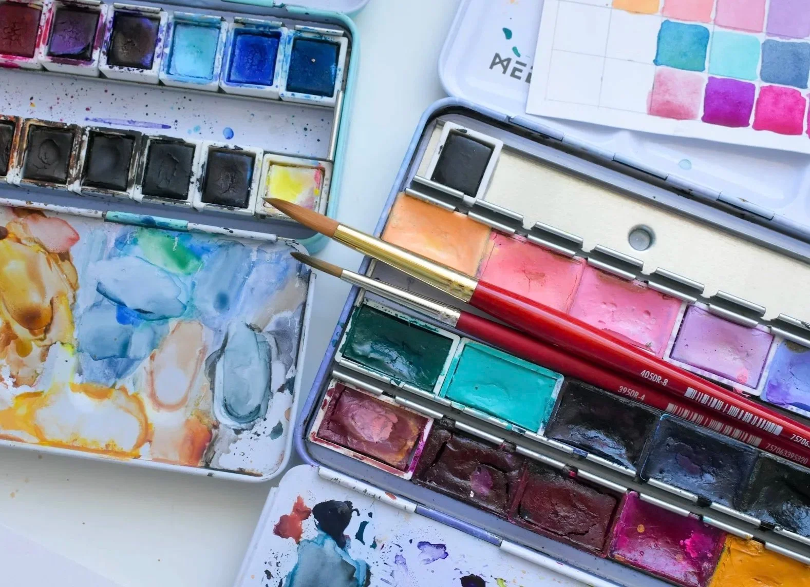
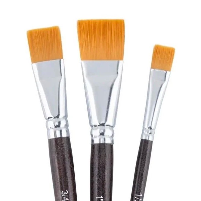
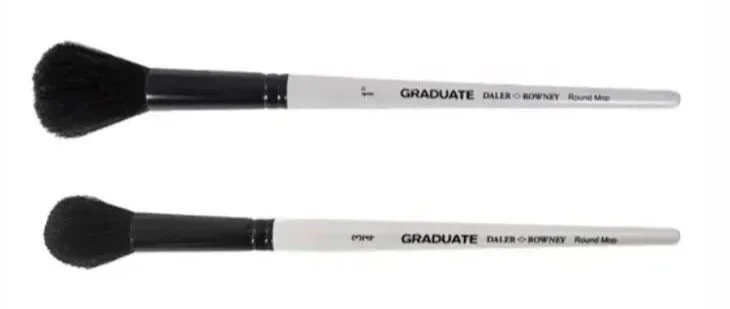
Brushes for Watercolour Painting
You don’t need a huge collection of brushes to start with, a small, thoughtful selection is more than enough.
Some useful shapes include…
Round brushes…the most versatile watercolour brush, ideal for washes, detail, fine lines, and expressive marks depending on size and pressure you apply
Flat brushes…useful for larger washes, broad strokes, and creating cleaner edges, or more geometric shapes
Mop brushes…soft, full brushes that hold plenty of water, perfect for loose washes and flowing colour across the paper
Soft synthetic brushes are a great choice for beginners. They’re affordable, easy to care for, and offer good control while still holding enough water for most techniques. Many now mimic the softness and absorbency of natural hair remarkably well, making them a great brush to begin with.
Sable and squirrel brushes are often praised for the amount of water they hold, the smooth flow of colour they apply, and the beautiful point they keep while painting. Although wonderful to paint with, they’re considerably more expensive, and not essential while learning. A good synthetic brush will easily give you many hours of successful painting, helping you build your skills and confidence.
(I’ll be adding a more in-depth section on brushes, at a later date)
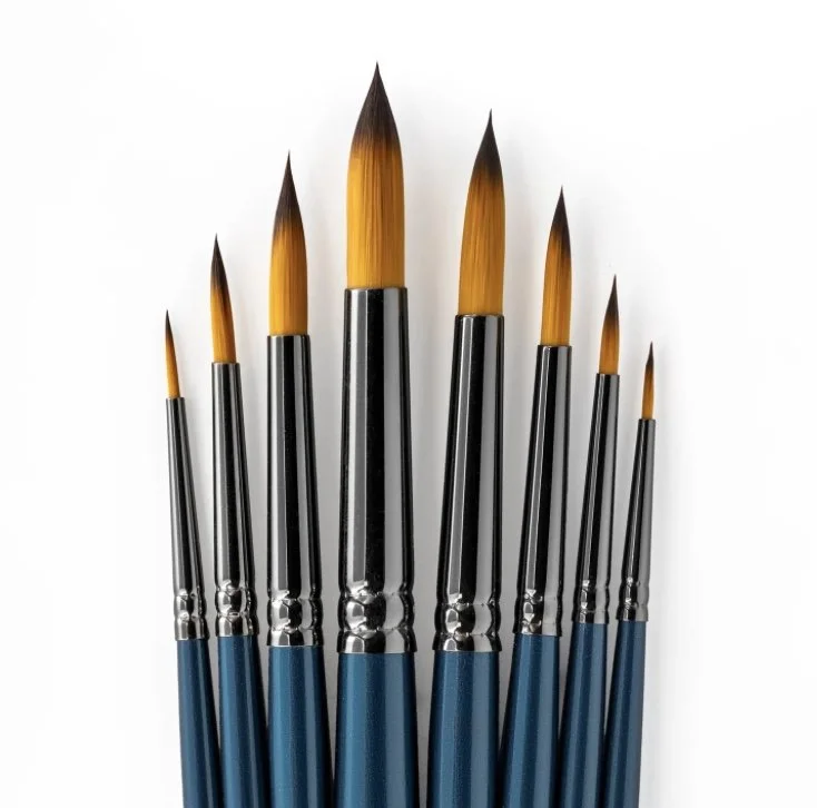
Round head
Flat head
Mop Brush
Different brushes can give different effects - from smooth even washes to more expressive, textured marks. They can blend colour and even help you lift it out. Play and experiment to find out what different brushes will do.
Care for Brushes
Don’t Leave in Water - it’s not good to leave brushes resting on their tips in a water jar, this will ruin their shape permanently
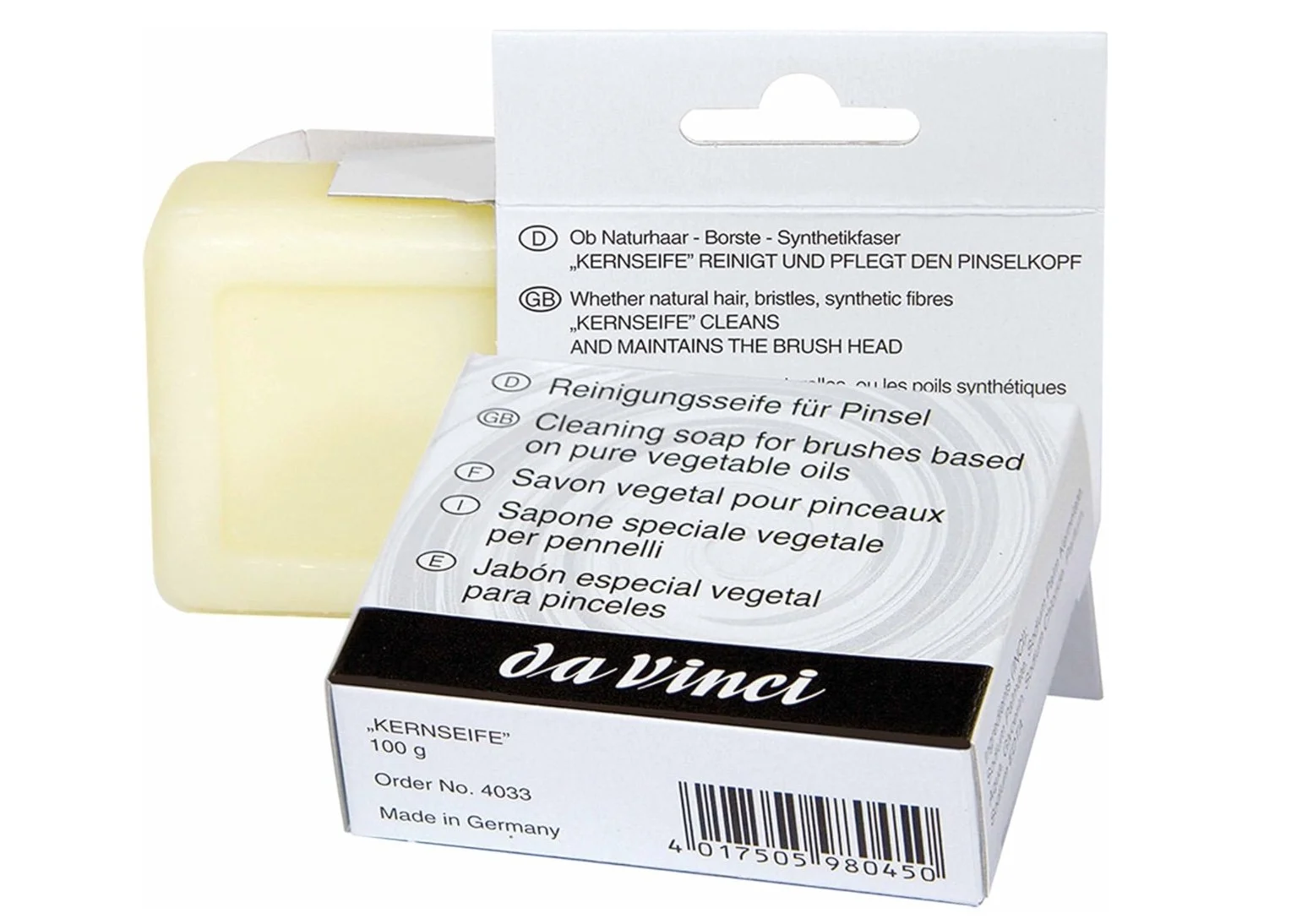
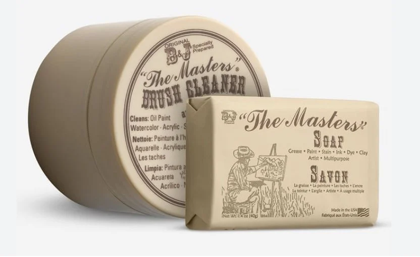
Cleaning - gently rinse brushes in lukewarm water to remove pigment, or use a mild brush soap like Da Vinci Brush Soap if they are stained or feel a bit clogged.
Reshape While Wet - after cleaning, gently reform the brush tip, especially for round brushes, to ensure they hold their shape
Drying - ideally dry brushes flat on a towel, try to avoid drying them upright, as water can collect in ferrule and loosen the glue
Avoid Hot Water - use cool or lukewarm water, as hot water can damage natural hair brushes, and loosen glue inside the ferrule.
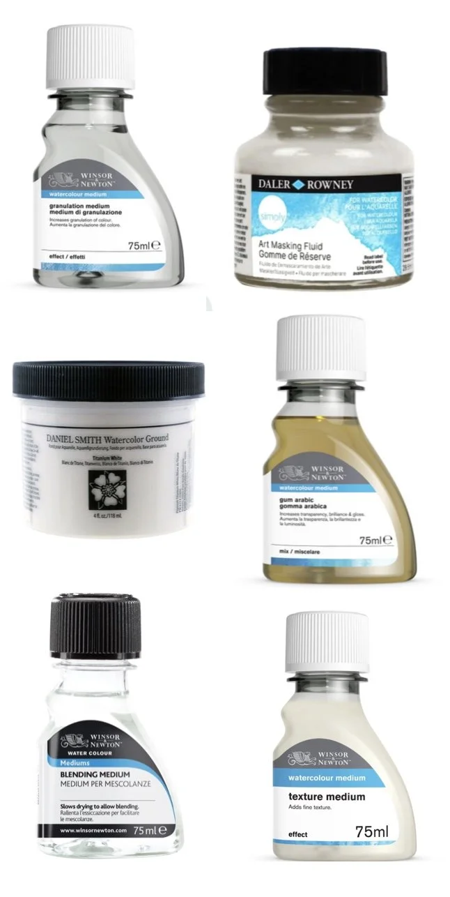
A Brief Note on Mediums
Watercolour mediums are additives used to change the behaviour of the paint, allowing you to alter texture, flow, drying time, and transparency. While water alone is absolutely fine for painting, these mediums offer you options for increasing transparency, creating texture, or even protecting specific areas of the paper
Masking Fluid - a latex-based liquid used to cover areas of paper, protecting them from paint to preserve white spaces, also known as Drawing Gum
Granulation Medium - encourages pigments to settle unevenly, creating a lovely mottled, granular, or textured effect
Watercolour Grounds - can be applied to surfaces like wood, metal, or canvas to create an absorbent, paintable surface
Gum Arabic - the main binder in watercolour paint, adding more of it increases transparency and gloss while slowing down drying time, which allows for smoother blending and layering
Blending Medium - extends drying time, making it easier to create soft blends and gradients, especially in warm climates
Texture Medium - adds body to the paint or surface, allowing for texture effects or increased structure
(I’ll be adding a more in-depth section on mediums, at a later date)
Watercolour Doesn’t Need To Be Precious or Intimidating
…and it certainly doesn’t need to be used only in a traditional or tightly controlled way. Some of the most exciting effects come from simply playing, experimenting, and allowing the paint to move naturally on the paper. In the early stages, it matters far less what the finished piece looks like, and far more that you begin discovering how the medium behaves and whether you enjoy working with it.
Surfaces for Watercolour Painting
Watercolour is heavily influenced by the surface you paint on, perhaps more so than other painting mediums. Paper affects how the paint flows, how colours blend, how large washes stay wet, and ultimately the overall feel of the finished piece.
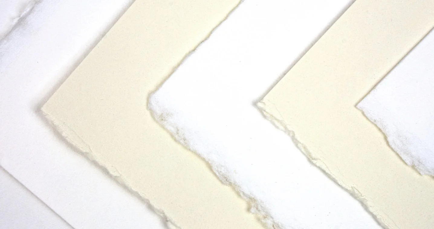
Good quality paper makes the experience far more enjoyable, and satisfying, especially while learning. Even simple techniques behave better on a well-made surface - while very cheap paper can cause colours to appear dull, dry unevenly, or make blending difficult. Over-working on cheap paper can also cause the fibres to shred and holes appear, which is so disheartening when you’ve spent time on a project.
The most traditional and widely used surface for watercolour…
Look for…
300gsm (140lb) paper - less likely to buckle when wet
cotton content for better absorbency and durability
acid-free paper for improved longevity
papers specifically labelled for watercolour
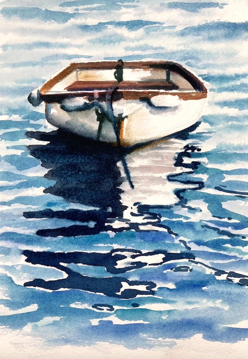
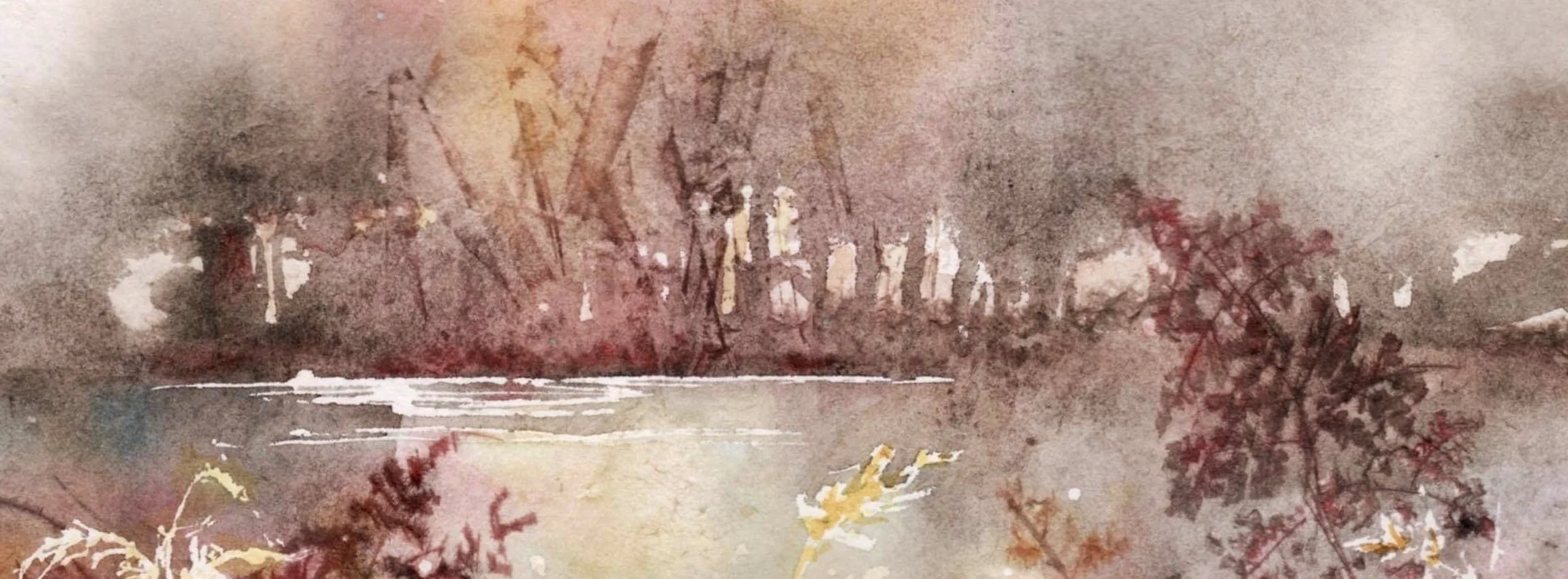
Sample done for Seascapes Workshop
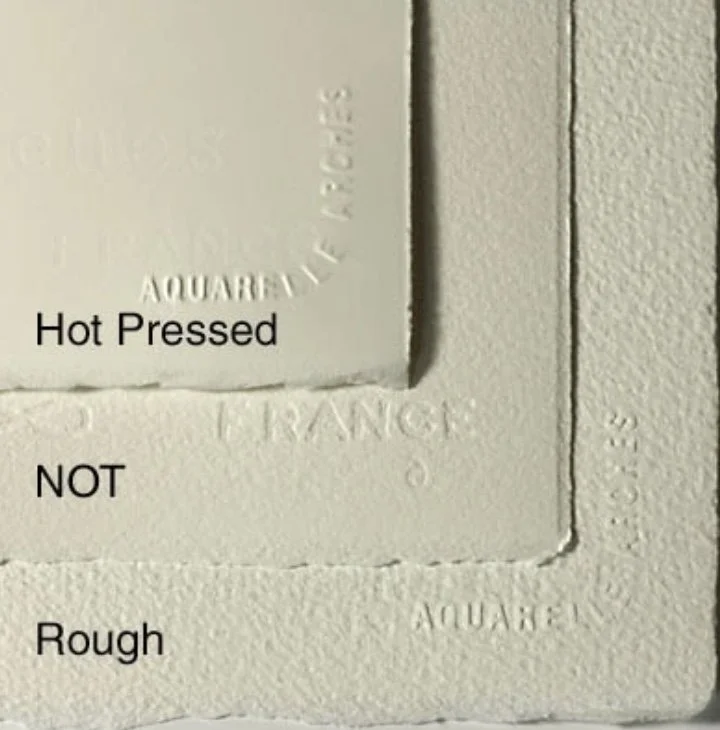
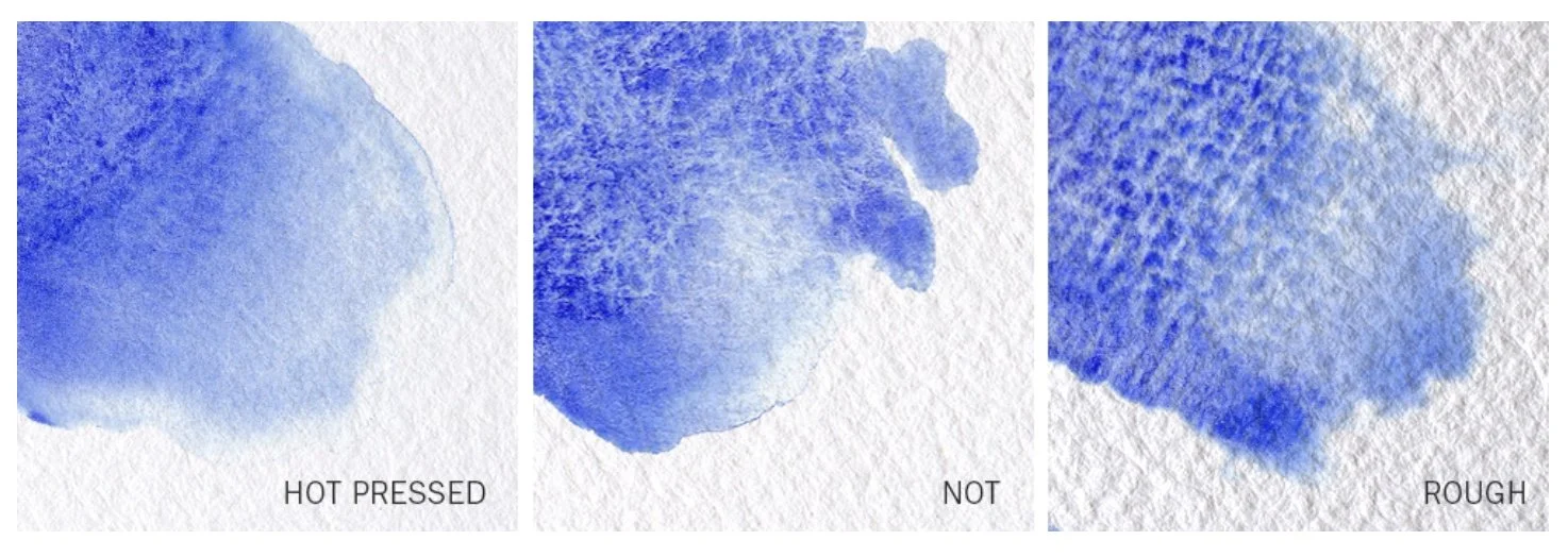
Paper Textures
Hot Pressed (HP) - as it suggests this paper has been through a hot press, squeezing the fibres of the paper down tightly to create a very smooth surface
Best for…
fine detail
illustration work
botanical or precise painting styles
Cold Pressed (NOT) - this has been through a cold press and is the middle ground paper; smooth-ish, but with a gentle texture that allows for control as well as softness, most popular
Best for…
general watercolour painting
both detail and washes
beginners learning different techniques
Rough Paper - a more textured surface; also more absorbent as the fibres are more open, so allows for better flow of paint
Best for…
loose painting styles
larger washes and granulation
expressive landscapes and atmospheric work
Sample Packs
Many brands offer a small sample pack of paper for you to try, and see which surface you prefer - often a good option when you’re first starting with watercolour
Watercolour Pads
A practical and easily accessible option, ideal for learning and regular practice, keeps all projects together in one place.
Usually…
available in spiral-bound or gummed pads
easy to store and transport
available in different textures and weights
Examples…
Winsor & Newton Cotman Watercolour Pads
Daler-Rowney Aquafine Pads
Strathmore Watercolour Pads
Best for…
practice and studies
experimenting with techniques
learning brush and water control

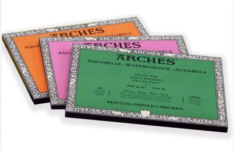
Glued Watercolour Blocks
Sheets are glued around the edges to help reduce buckling while painting - but it can feel a bit scary when it comes to separating your finished painting from the block for fear of tearing
Pros…
paper stays flatter during wet washes
no need to stretch the paper beforehand
convenient and easy to work on
Examples…
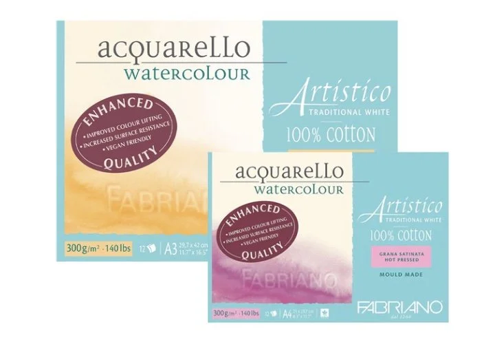
Arches Watercolour Blocks
Saunders Waterford Blocks
Fabriano Artistico Blocks
Best for…
larger washes
painting outdoors or travelling
artists who prefer a stable surface
Loose Sheets
Single full sheets of paper, available in a variety of sizes.
Pros…
more economical long-term
freedom to cut paper to custom sizes
often available in professional-quality cotton papers
Examples…
Arches
Saunders Waterford
Fabriano Artistico
Bockingford
Best for…
larger paintings
experimenting with expressive mark-making
custom framing sizes
How the surface affects your painting
Different surfaces change the way the paint behaves and the overall feel of your work…
Hot Pressed – smooth, ideal for fine detail, and precise painting
Cold Pressed (NOT)– gentle texture, versatile, general use
Rough Paper – more textured surface, breaks up colour well, allows for more expressive marks and effects
Watercolour Blocks – gives stability and resistance to buckling, especially helpful for wetter techniques and larger washes
Loose Sheets – flexible, adaptable, ideal for larger paintings and experimenting with different formats